Every year we put together a list of the best websites in the insurance industry, focusing on user experience and usability. There are three things that customers want from insurance companies: ease, choice, and advice. Our 3-person team of UX experts used these same criteria to select and evaluate world’s best insurance websites.
1. Ease of Use
An insurance website should make it easy for visitors to find information. Users must be able to complete common tasks quickly, such as filing claims, applying for coverage, reviewing and making changes to a policy, paying a bill, etc. In our assessment, we determined “ease” by focusing on website navigation, information architecture, and how easy it was to find information and complete common tasks.
2. Choice
Insurance customers want to feel that they are in control and getting the best deal possible. Unfortunately, insurance is complex. Insurance terms, especially those regarding coverage, are unfamiliar to most people, which makes it hard to differentiate one plan from another. One way to give users more control is to help them understand the risks and make educated decisions about their purchases. The best insurance websites provide clear choices, such as including side-by-side comparisons of different policies and giving explanations about policies, coverage, and risks in simple terms.
3. Advice
Purchasing insurance is an emotional decision—users are looking to protect their life, health, home, family, or valuables. It is important for users to feel that they are being served well during this process. People often seek guidance and reassurance when it comes to insurance. We judged how well insurance websites succeeded in the “advice” category by how effective they “humanized” the experience of helping, guiding, and reassuring users online.
Here is our list of best insurance websites based on the criteria of ease, choice, and advice from a user experience and usability perspective.
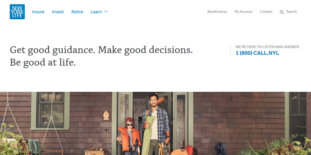
One of our personal favorites, NYL is hands down one of the best insurance websites in the industry. This uncluttered, clean, and straight-to-the-point website sets the user experience bar a mile high with memorable taglines, effective images, and a brilliant, conversational wizard that cuts through the clutter and gets you to the right part of the website. New Your Life knows how to keep website visitors engaged with beautifully designed storytelling pages. The NYL website scores off the charts for many of the UX best practices: intuitive navigation, text readability, use of colors, highlighting salient points, and scrolling progress bar (nice touch!). All of these elements make this our highest scoring website for ease, choice, and advice.
New York Life's brilliant, conversational wizard engages visitors and provides a memorable user experience.
UX Recommendations
The navigation menu doesn’t reflect which page you are currently on, which could be disorienting. NYL should consider highlighting the active section in the menu. Also, most pages of the website are strikingly similar to the homepage, which could further confuse users about the “starting point” of the website. Our recommendation would be to make the homepage visually different from the inner pages so it is feels more like a homepage in comparison to the other pages. All things considered, these are minor recommendations for what is an outstanding website.
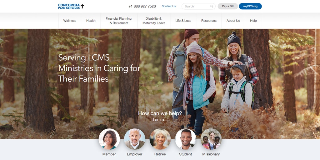
Concordia Plans Services (CPS) is consistently one of the top-rated insurance websites when it comes to user experience. The website’s user-centric information architecture (IA) is based on distinct user types and the intuitive audience-based navigation is fully aligned with its customer journeys. A wizard, which is prominently integrated into the website, is designed to help users depending on who they are and the tasks they need to complete. This puts users in control, gives them advice, and humanizes the user experience. CPS’ website has been hailed by insurance marketing professionals as “one of the best in the industry” for ease, choice, and advice. It is also one of the best insurance website case studies, where UX has made all the difference by delivering specific business results.
The user experience of CPS' website has been hailed as “one of the best in the industry” for ease, choice, and advice.
UX Recommendations
To further improve user experience and lower support costs, Concordia Plans Services should consider switching to electronic forms and eliminating some forms altogether. The Member/Employer Portal should also be upgraded to a centralized, user-centric experience where members and employers can manage their accounts and interact with CPS without the use of forms.
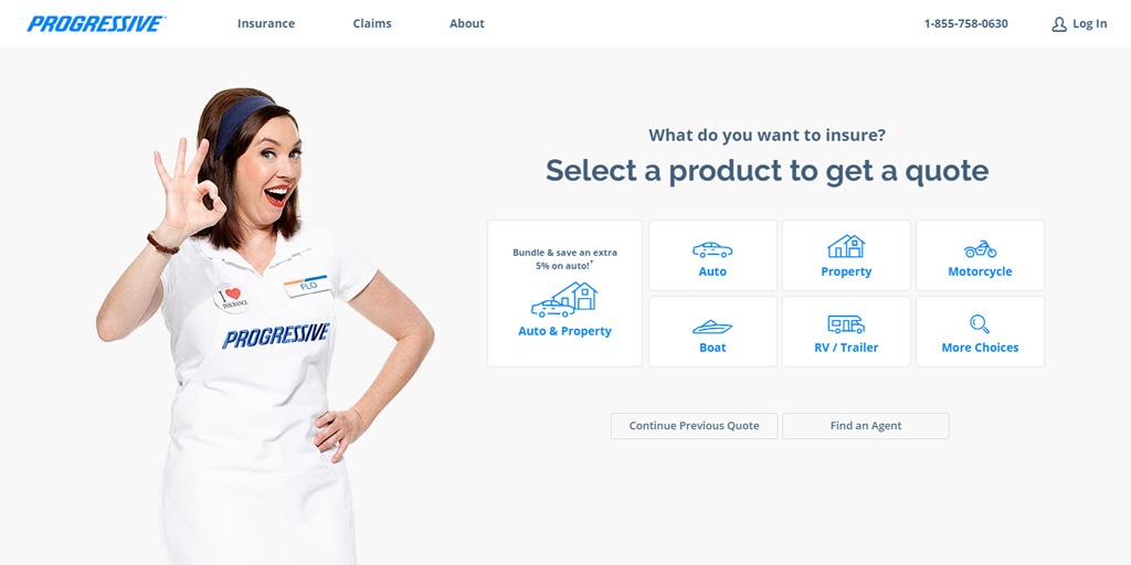
Progressive’s website lives up to its name. Flo, the company's iconic brand character, is front and center, projecting her upbeat personality and familiar enthusiasm. It’s almost as if Flo is there by your side, helping you select insurance products or get a quote – all through a homepage wizard. What a great way to humanize the digital experience! The website is also full of engaging, informative, and highly visual storytelling pages that cover the products and services using attention-grabbing UX techniques and strategically-placed calls to action. The Progressive website scores very high in the three areas of ease, choice, and advice
Flo, Progressive's brand character, humanizes the experience by leading visitors through the website with her enthusiasm and upbeat personality.
UX Recommendations
The navigation menu does not make it clear which page of the website you are currently on (there are no breadcrumbs and the collapsing menu doesn’t highlight the current section). The website’s local navigation does a better job of that, but on the hub pages, it appears in the center of the page, which could be confusing and disorienting. Finally, a site as big as Progressive’s should have easily accessible search functionality.
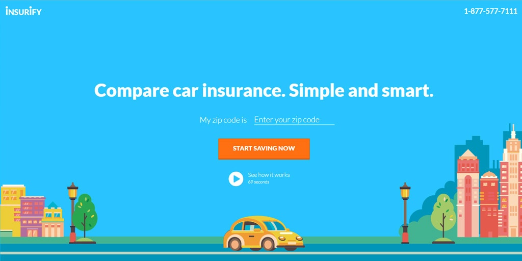
Insurify is everything insurance industry isn’t known for: it is simple, it is frictionless, and it is quick. The website scores off the chart for ease, choice, and advice. There is no other online experience that does a better job finding the best auto insurance with the same level of guidance, ease, and transparency. In fact, the only reason insurtech companies like Insurify exists is because traditional insurance websites have fallen behind in user experience. Insurify removes friction and complexities by providing a laser-focused, streamlined UI that uses the best techniques of progressive disclosure and AI to find the best quotes, and allows you to compare your options.
Insurify's website removes friction by providing a laser-focused, streamlined UI that uses the best techniques of progressive disclosure.
UX Recommendations
The website does a great job letting you resume where you left of simply by returning to Insurify at any point. However, there is no easy way to “cancel” or start over. In fact, you can do this only after selecting your car (which is a multi-step process). The process is so streamlined towards the finishing line that it is not very forgiving when it comes to making mistakes. It is tricky to go back to correct them and in some cases, you have to start over. The website could be improved by giving users the ability to skip steps or return to previous screens to make changes.
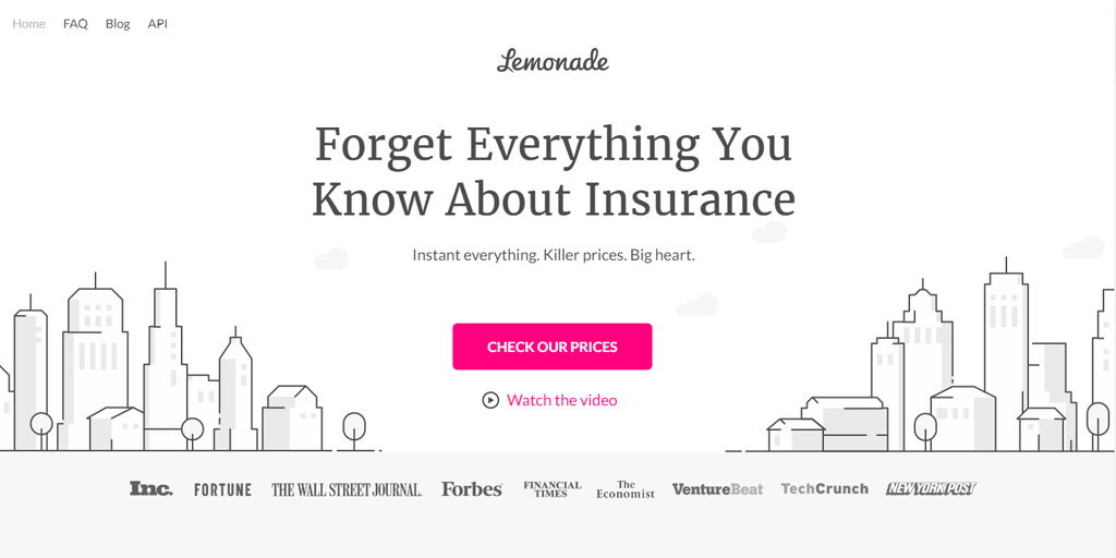
Lemonade wants to you forget everything you know about insurance. And that’s exactly what they’ve done with their website: replacing complicated, slow, and expensive with simple, quick, and affordable. Lemonade knows that good UX is good business and they mastered the art of storytelling with their highly engaging one-page (!!!) website. Every element of the website has been user tested and refined: from the messaging and the supporting visuals to the use of videos and the strategically-placed CTAs ending with the “Maya” artificial intelligence bot. All of this helps users craft the perfect insurance policy for their needs. Lemonade’s explosive growth is a testament how UX is transforming insurance and insurtech.
Every element of Lemonade's engaging website helps visitors craft the perfect insurance policy for their needs.
UX Recommendations
Coming up with UX recommendations for the Lemonade website was not easy (kudos to Lemonade’s UX team!) but we managed to come up with few. Using bright pink for speech and chat bubbles is a nice touch, but it may draw attention from the CTAs (revealed by squint test). We would recommend user-testing toned-down colors for those. Scrolling is easier than clicking for most users, but having anchor links in the menu to the corresponding section of the page may give some users an easier way to jump to the information they care about.

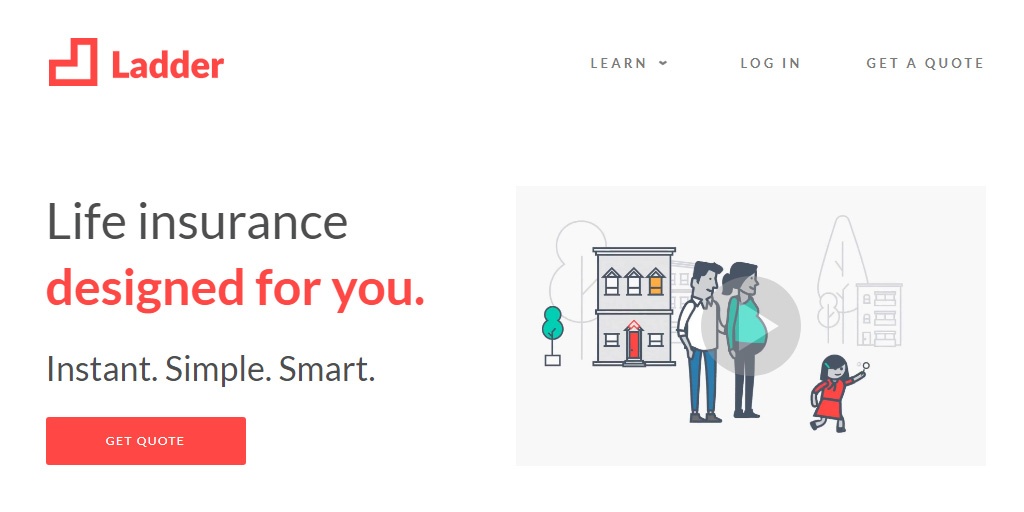
Ladder is looking to disrupt the life insurance market the same way lemonade disrupted renters/homeowner’s insurance. And they are doing it in a strikingly similar way: focusing on a single effective storytelling homepage with a few support pages. This format works well and creates a memorable and positive user experience: chunking information and focusing on one concept at a time, creating emotional moments, offering social proof, and finally offering an incredibly simple, conversational process to get a quote. All of this helps Ladder score high points for ease, choice, and advice.
Ladder's website succeeds by chunking information, creating emotional moments, and making it easy to get a quote.
UX Recommendations
As effective as the homepage is, it is easy for users to lose focus and drift away on other pages of the site, which are essentially in the good old boring FAQs format. A better solution would be to develop more storytelling pages that provide “novelty” with engaging visuals to keep the user reading. This is especially important when it comes to educating about topics like life insurance basics.
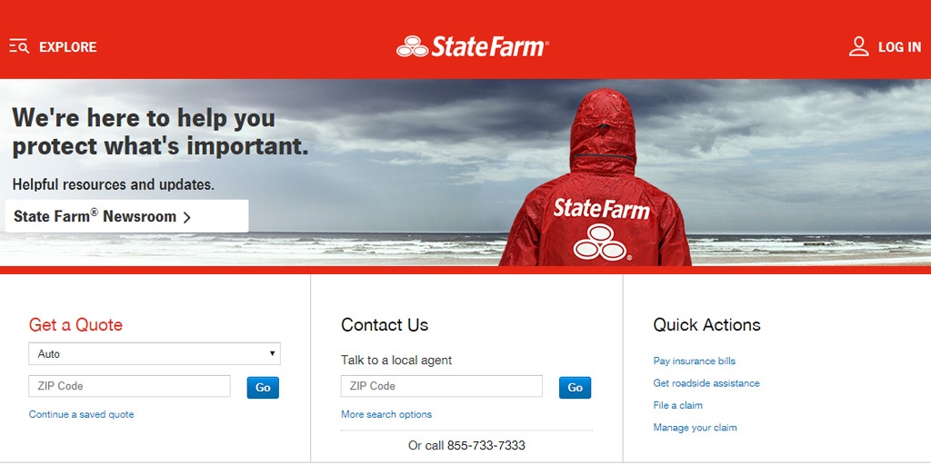
State Farm’s website places less focus on emotional connection and more to getting you to the right place. The “What We Offer” and the “Explore” mega-menu navigation make it easy to explore everything related to State Farm – this is a great way to introduce users to the wide choice of insurance products the company offers. The website also strategically guides users straight from the homepage: emergency alerts are placed prominently, users have direct and easy access to getting a quote, getting roadside assistance, or filing a claim. State Farm also “humanizes” the experience by presenting users with the option of continuing the conversation with a local agent simply by typing in their zip code, which is a great “advice” feature.
State Farm's “What We Offer” and the “Explore” mega-menu navigation make it easy to explore everything on the website.
UX Recommendations
When showing a ‘How Can We Help You’ experience, users typically expect to see a chatbot or a wizard of some sort. In State Farm’s case, it is merely a search bar, and that is likely to confuse some people. State Farm should also consider changing the icon and label from the “Explore” to a traditional hamburger “menu” that is more consistent with established UX patterns. Finally, State Farm could benefit from more effective service pages redesigned to combat “tuning out” through novelty and storytelling.
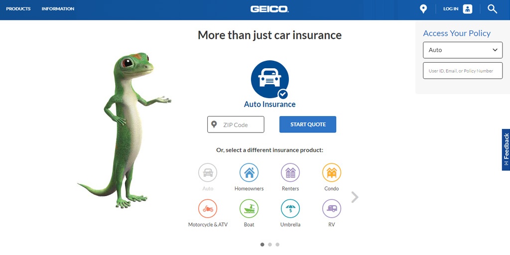
Geico’s website takes a very clean, uncluttered approach to the homepage. Just like Flo on Progressive’s website, the famous Geico Gecko humanizes the digital experience by giving guidance and advice, helping with the selection of insurance products, and starting the quote process. The website makes great use of UX icon best practices and color-coding that helps users find various insurance products and sections. It also does a good job explaining what’s included with various policies and addressing FAQs.
The Geico Gecko is prominent throughout the website, offering guidance, advice, and helping select insurance products.
UX Recommendations
Calling the entire section of the website "Information" is not intuitive and has low information scent about what’s included in that section. Geico could improve information findability with either a more traditional menu that lists out top sections or a hamburger menu or by listing out both insurance products and various services. Also, presenting Geico products using a carousel-like scroller potentially creates an “out of sight, out of mind” problem where some products remain hidden. Grouping insurance products and using progressive disclosure may increase findability and reduce interaction costs.
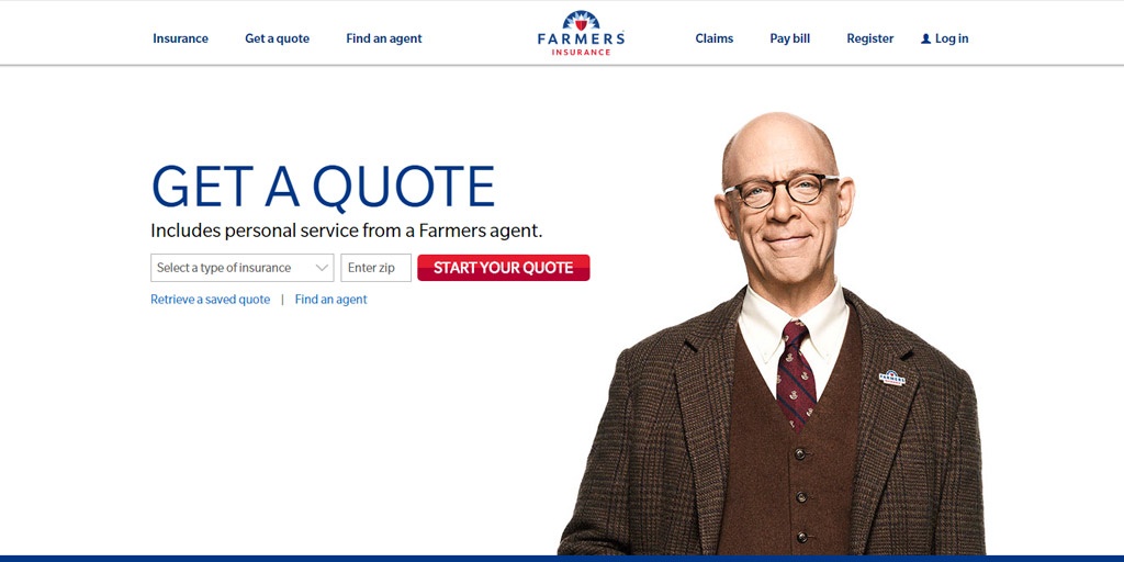
Traditional insurance companies like Farmers Insurance understand the importance of humanizing the experience of insurance shopping. How can you ignore J.K. Simmons on the homepage of the website? The “insurance professor” establishes immediate trust and credibility, which is a great way to get users started on the quoting process. In addition to that, Farmers website makes great use of icons that follow best practices to browse an extensive range of insurance products on the homepage and in the navigation menu. This makes it easy to find information.
Farmers Insurance's website makes effective use of the J.K. Simmons brand character and icons to display an array of insurance products.
UX Recommendations
Start Your Quote…Wait… where did J.K. Simmons go? We were expecting to see his confident, reassuring smile along the way, not just on the homepage. The scrolling of the insurance products on the homepage should be avoided, especially considering it is possible to fit them all by making icons smaller or adding another row. The navigation menu’s behavior is inconsistent and could be confusing: "Claims" opens a pulldown menu to choose from, whereas the neighboring "Pay Bill" is a direct link (but the "Claims" menu remains open). Finally, as effective as the homepage is, the same cannot be said about the inner pages; they feel wordy, cluttered, and templatized.
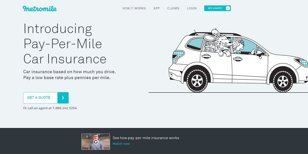
Metromile doesn’t feel like a typical insurance website, because Metromile is not your typical insurance company. Their Pay-Per-Mile car insurance concept is based on how much you drive, which requires some explaining for the average consumer. Fortunately, the website does explain it very well with effective taglines, illustrations, and an explainer video. The website consists of brilliantly-executed storytelling pages that use the best UX principles designed to attract and hold users’ attention. It is refreshing to see the Claims process featured and explained so clearly. The entire website feels very user friendly and scores high points for ease, choice, and advice.
Taglines, brilliant storytelling and an explainer video helps communicate Metromile's innovative insurance concept to website visitors.
UX Recommendations
The Get a Quote button doesn’t follow familiar UX patterns, behaving as both a button and a field; this is guaranteed to confuse some users. Metromile could also explain how its insurance product is better than traditional insurance right on the homepage. The FAQs should also be more prominently featured, as most people will have questions about this “new” type of insurance.
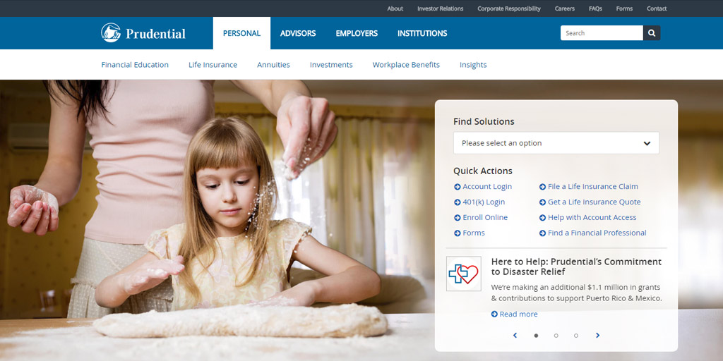
The Prudential homepage scores high marks for using large, family-oriented photographs of human faces to harness the power of emotion and storytelling. It also separates the content using audience-based navigation and has an effective information architecture. The website contains a wealth of content for research (which is what all insurance buyers want), but navigating to some of it could be tricky (see our UX concerns below).
Prudential's website succeeds by using compelling family-oriented photographs and an effective information architecture.
UX Recommendations
Prudential should consider improving the “Find Solutions/Quick Actions” area of the homepage. This section has low information scent (the choices hidden in a dropdown) and the full sentence format could result in a sensory and cognitive overload. A better solution might be a wizard that guides the user to the corresponding section on the website, helps find the right form, etc. An effective example of that is on the Concordia website. Furthermore, Prudential should consider following best UX practices for linking articles’ titles and thumbnails to corresponding pages (strangely, they are not), as well replacing the antiquated Flash video players with HTML5.
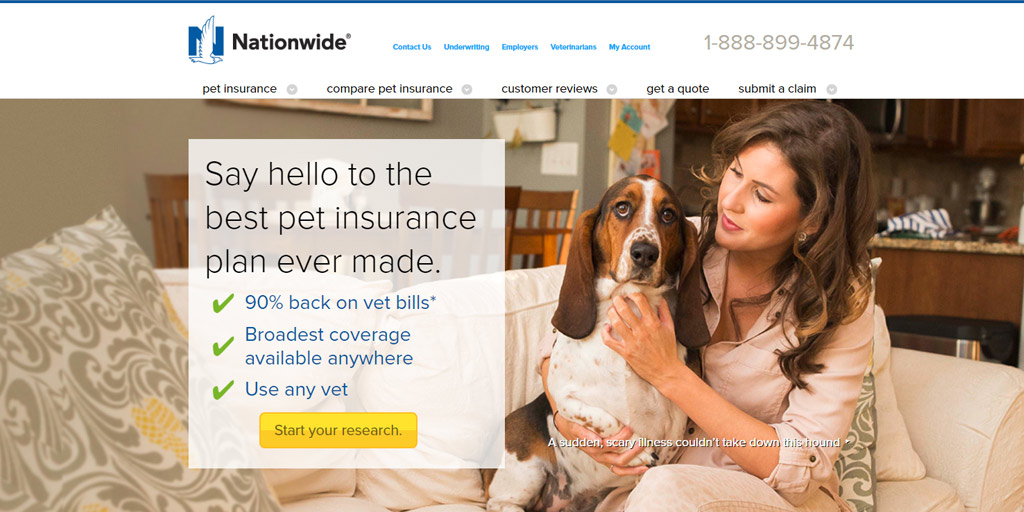
The Pet Insurance website isn’t the most beautiful website on our list, but it does a great job of harnessing the power of emotion and storytelling with images and eliciting emotional responses from visitors. Following the initial reaction, the website also presents clear value propositions explaining why their pet insurance is better. On the Pet Insurance website, Cat and Dog Insurance is very clearly separated. There is also a very clear representation of what each insurance plan covers, a very effective pet insurance comparison, and plenty of social proof. This helps the website score high marks for “choice” and “advice.” The engagement form to “Tell us about your pet” is one the cleanest and most streamlined we’ve seen in the insurance industry.
The Pet Insurance by Nationwide website uses the power of emotion and storytelling and conveys benefits with clear value propositions.
UX Recommendations
We found the dropdown and utility menu options were too small and had insufficient contrast, which might affect text readability and the findability of information. Also, the identity of website is somewhat confusing. The Nationwide brand comes with weight and recognition, but the website is called “Pet Insurance.” Perhaps presenting the website as “Pet Insurance from Nationwide” would make it clearer.
Insurance & Insurtech Honorable Mentions
The following websites didn’t make our Top 10, but they still deserve plenty of recognition for their dedication to setting a high bar for user experience in insurance and insurtech:
Ready to start improving your insurance website? Sign up for a UX audit today.
