


User Experience Design (UXD or UX) in web design is the process of enhancing user satisfaction by improving the usability, accessibility, and efficiency of user interaction with websites. Here at Intechnic, we’ve been studying and applying the best user experience principles in our work. Earlier this year I became the 9th person in the world to earn the prestigious Master of UX Certification from Nielsen Norman Group – the world’s authority on UX design. I would like to share some of the best practices I’ve acquired over the years (including Top Symptoms of Poor UX and Top UX Statistics). Here is my list of 100 Top UX Practices every web designer should follow:
Flow
1. Think of the website as a yellow brick road: move users seamlessly from one section to the next by understanding user personas’ goals and needs.
2. Users are more likely to notice items near the top of the page, in order of their importance.
3. Consistent and easy-to-use web interfaces help users concentrate on the content and move through it.
4. Avoid creating dead end pages on websites. They cause confusion and create additional work for users.
5. Use common website patterns and interfaces; don't make users learn something new.
Scrolling
6. Users will scroll down the webpage as long as it is clear that additional, relevant information is below the fold.
7. Your website should always provide a strong visual indication of the direction of scrolling and whether more content is available.
8. The longer the website page, the less likely someone is to scroll down to the bottom.
9. Running webpages are nice because scrolling is faster than clicking - just don’t make the pages too long.
Contrast & Color
10. Design for color blind users. Convert your designs to grayscale to ensure all users can read important info.
11. Don't use the color blue for any text on websites other than links.
12. Be aware of the contrast on mobile websites. Screen glare can render your website unusable.
13. Reserve one color for CTAs on your website and don't use it for anything else.
14. Warm, bright colors come forward and cold, dark colors stay in the background.
Loading
15. Make sure website users can complete their primary goal quickly and easily.
16. What matters the most to users is that your website feels fast (even if it is just their perception).
17. Perception of website speed is based on load time, load behavior, waiting times and smoothness of animations.
18. Show a skeleton of the website’s elements to communicate the layout when it is loading.
19. Website text should load before images so users can start reading before the rest of the site loads.
20. Delays longer than several seconds will often make users leave the website.
Mobile
21. Mobile interface elements are hard to tap accurately if they are small or close together.
22. The minimum size for a touch target on mobiles should be 1cm x 1cm with proper padding.
23. Someone using a pinky finger on your mobile website or app means that the interface targets are too small.
24. When holding a tablet, the sides and bottom of the screen are most easily reached with the thumb.
25. Don't require vertical swiping for anything other than normal webpage scrolling.
26. Don't use double-taps on mobile devices. Make sure users can interact with a single touch.
27. Determine whether users will use devices with one hand or two when designing mobile layouts.

Navigation
28. Always have an obvious way to access the navigation menu on your website.
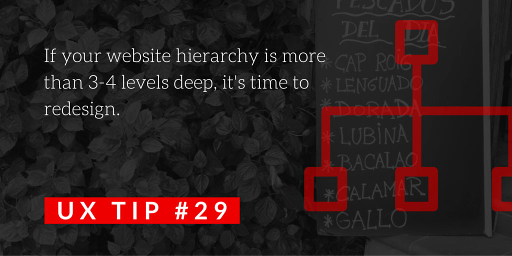
29. If your website hierarchy is greater than 3-4 levels deep, it's time to redesign.
30. Consider using sticky menus, especially on longer webpages or when quick access is needed.
31. Good website navigation is not in the way, it disappears into the background.
32. Make your navigation consistent; it shouldn't change throughout the website.
33. Make navigation labels specific, no more than 2-3 words and start with the most information carrying word.
34. Let users know where they are on the website by using breadcrumbs.
35. Mobile navigation: Show the most frequently used options and hide the others under a hamburger menu.
36. Hamburger menus on desktops are less noticeable, less familiar, increase interaction cost and diminish information scent.
37. For secondary navigation on mobiles, use category landing pages, submenus or in-page menus.
38. Menu dropdowns should be vertical, not horizontal hover; it is much harder to scroll horizontally.
39. Megamenus should be narrower than the page so it is easy to “click out" of them.
40. If using megamenus, organize links into groups and distinguish between clickable and non-clickable items.
41. Don't hide login or search features inside website menus.
Forms
42. Align form labels and fields in a single vertical line to allow for fast scanning.
43. Field labels should be outside the text field, not inside, so users do not lose track of them.
44. Split up sections with separators to make long web forms more user-friendly.
45. Put form errors next to the error-causing fields on all web forms.
46. Error messages should be helpful, usable, concise and easy to understand.
47. Show all error-causing fields at once, next to each problematic field so mobile users don’t miss the warning.

Links
48. Links on websites must stand out – use blue text and/or underlining to indicate hyperlinks.
49. Links should always look like links.
50. A user shouldn't have to click on a link to figure out where it leads. The link text should tell them.
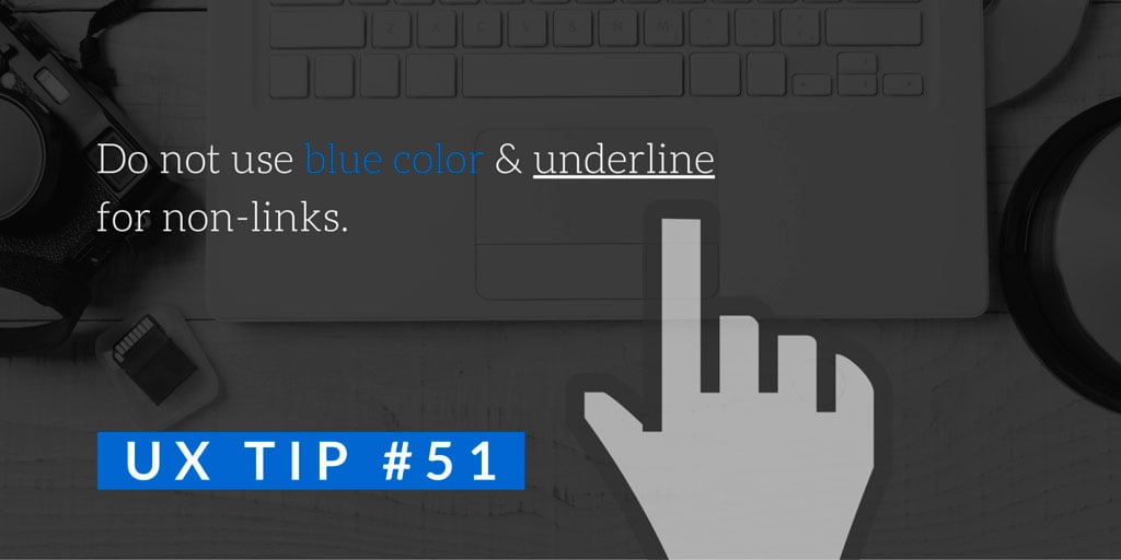
51. Don’t use blue text or underlining for non-linked elements in websites or apps.
52. A reference to a full URL anywhere on a website should always link to that page.
53. Certain elements, such as product images or reviews, are always expected to be clickable.
54. Use a different color for visited links on websites to reduce users' memory load.
Buttons
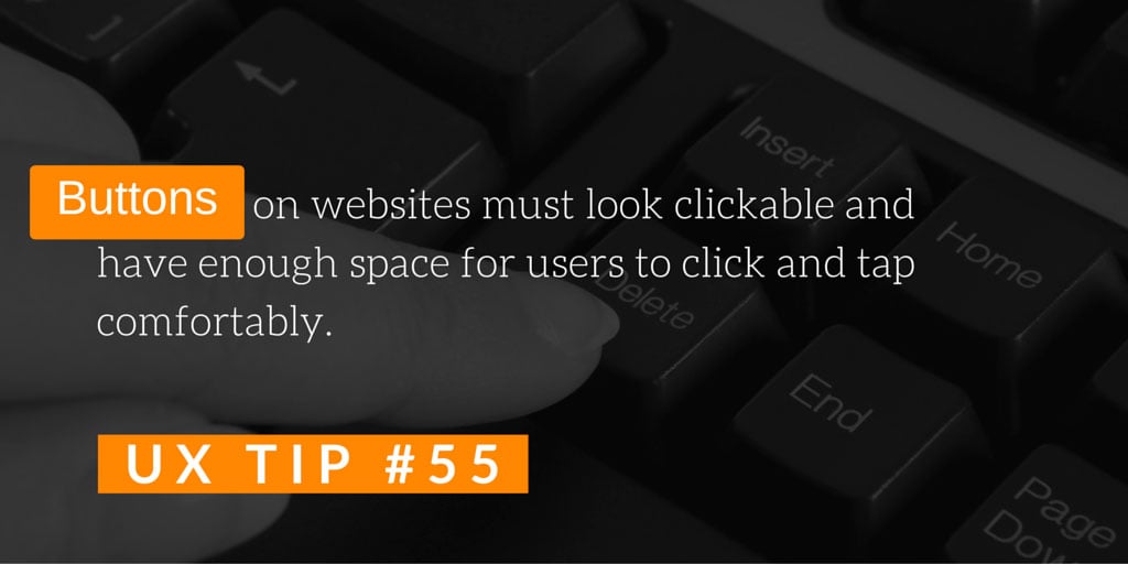
55. Buttons on websites must look clickable and have enough space for users to click or tap comfortably.
56. Frequent actions on websites or apps should be large buttons, placed in easily reachable zones.
57. Background colors, borders and action-oriented labels on a website signal to users that an element is clickable.
58. For flat designs, make sure that action buttons are done in a contrasting color with an action-oriented label.
59. A website should have a visual cue that a button click was successful within 0.1 seconds of the interaction.
60. Buttons that change or delete data on mobiles should require more effort to tap to prevent accidental tapping.
Search
61. Unless you have a very small website with little content, always have a search field.
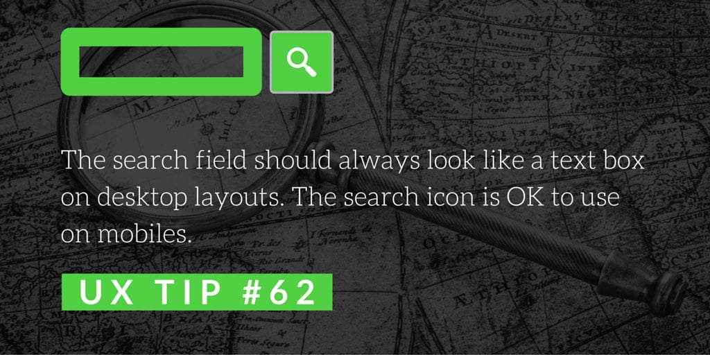
62. The search field should always look like a text box on a desktop. The search icon is OK to use for mobile.
63. Make the search field easy to find. Users typically look for it in the top right corner.
64. When looking for search on websites, users typically look for a "little box to type in."
65. Search fields on websites should be wide enough to see the entire search query 
Carousels
66. Avoid carousels: each new slide erases the memory of the previous slide. Users can focus on only one thing at a time.
67. Dots on carousels are difficult to see on mobile websites. Use images peeking from the left and right instead.
68. Instead of carousel navigation arrows, use descriptive labels so users know what to expect on the next slide.
69. Only about 1% of users click on carousel slides on websites so don't rely on those clicks.
70. Website carousels that slide automatically should switch to manual once users interact with them.

Accordions
71. Use accordions to compress lengthy content on mobile websites.
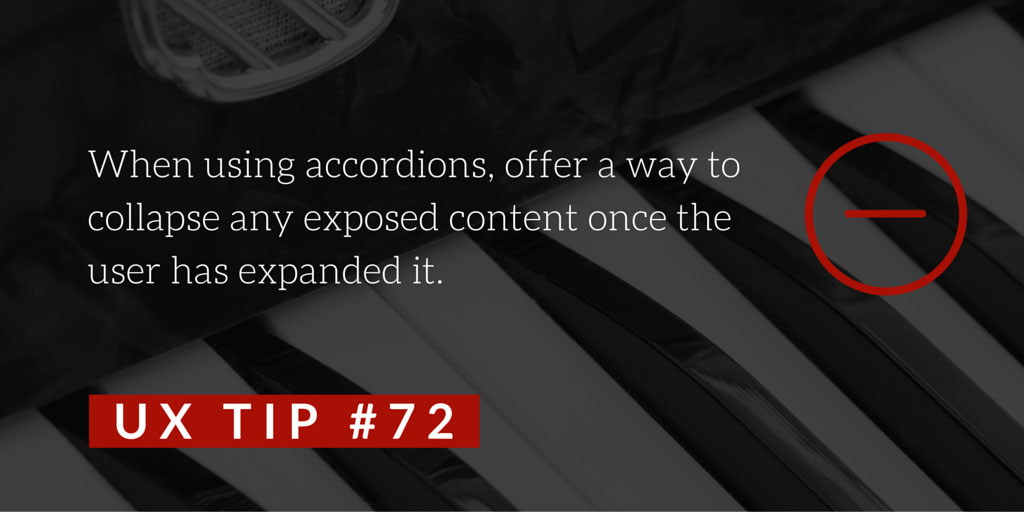
72. When using accordions, offer a way to collapse any exposed content once the user has expanded it.
73. Pros of using accordions on mobile websites: Shorter pages are easier to use than in-page jump links.
74. Cons of using accordions on mobile websites: Increased interaction cost; out of sight is out of mind.
Help and Hints
75. The main purpose of each webpage should be obvious to the user.
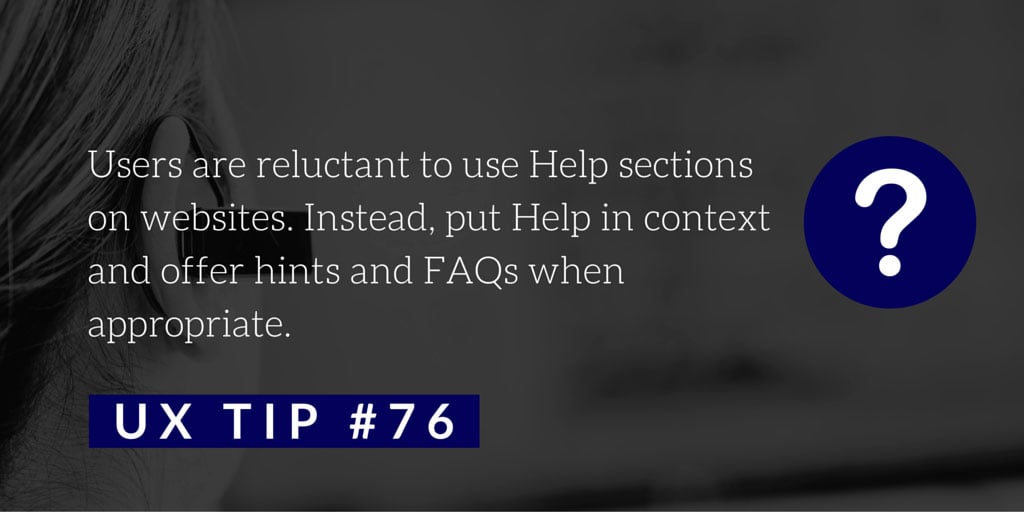
76. Users are reluctant to use Help on your website . Put it in context and offer wizards and FAQs when appropriate.
77. Display hints on websites and apps in context and only when needed.
78. Help and instructions should be short and visually different from other interface elements.
79. Only present one hint at a time on websites and mobile apps. This reduces memory burden.
Icons
80. Icons must visually describe their function and purpose. Make them simple, familiar and meaningful.
81. Icons should only be used when necessary. Avoid overusing them and do not use them simply for decoration.

Content
82. The most important information on your webpage should always stand out as the most visually prominent.
83. Put key information first. Users start at the top left and the first 2-3 words are scanned the most.
84. Place high-priority content at the top of the website page. Use analytics to determine priorities on different devices.
85. Use color and size contrast on your website to differentiate primary information from supporting details.
86. Priorities, such as context, location, and emergency information, are more important for mobile users.
87. Priorities for mobile: Location, events, phone number, emergency info, time-sensitive info and info needed on-the-go.
88. Simple, obvious terms are better than industry jargon or trendy terms for website navigation.

Readability
89. Most users scan first and read later. Use visual variety and meaningful text to make scanning easier.
90. Readability isn't just about whether you can read something - it's also about whether you want to read it.
91. Use increased line spacing between bulleted lists, numbered lists, lines and paragraphs to increase readability.
92. When choosing a website font, consider its legibility, readability, weights and styles.
93. On mobile websites and apps, consider making a font's x-height larger to improve its readability.
94. Avoid small fonts on all devices, especially for long form copy. Do not use condensed fonts in body text.
 95. Make sure that the text size for headlines on a mobile website is as responsive as the rest of the content.
96. Increase font size on mobile websites - always scale font size to the screen size.
97. Banner Blindness: users take effort not to look at anything that looks like advertising banners.
98. Make long text blocks easier to read by including only one idea per paragraph.
99. Italicized text is harder to read, especially for dyslexic readers.
100. DO NOT USE ALL CAPS IN YOUR HEADLINES AND TAGLINES. It's much harder to read.


