 UX design is about understanding the way users interact with your products or services. As UX designers, striking a balance between technology and the basic principles of human interaction and behavior is one of your hardest – and most important – goals. It’s also one of the things that makes it so exciting. As UX designers, we are continuously working to become better communicators, especially in the ever-changing landscape of technology. Below are three UX design tips to help improve user experience and communicate effectively to your users.

1. People Prefer Established Patterns
We love patterns. In fact, we use patterning to identify the objects around us, at all times. Even if someone has never before seen a particular model of car, for example, they use patterning to identify that it is, indeed, a car. Rather than storing millions of images in our minds, modern theories (such as Biederman’s recognition-by-components) suggest that we break images down into basic shapes called geons. Looking at just about anything around you, you can begin to identify the basic shapes those objects are made of, and how you, as a designer, might replicate those objects using geons.

So how does a UX designer use this patterning to their advantage? The answer is through affordance cues. These cues tell you what to do with an object once you see it, such as a “push” or “pull” sign on a door. Here are some examples:
Buttons
In the physical world, a button is a three-dimensional object that you can press with your finger. Therefore, the same look and feel of physical buttons has been incorporated into the digital world to distinguish “clickable” objects, using 3D effects. But in new design trends, particularly in flat designs, 3D images are simplified to two dimensions; so, affordance cues such as shape and color (typically a rectangle of a unique color) help users know that something is still a “clickable” button. Avoid using this unique button color and rectangular shapes for non-buttons.
Links
The traditional affordance cue for a link is blue, underlined text. But that’s no longer always the case. Underlines can be omitted, and colors may be changed. But users still need to know that certain text is a link that they can click on. UX designers can communicate this by using a certain color for only links and nothing else, and by not underlining things that aren’t links. Because of patterning, users have come to expect that underlined text is a link, so don’t confuse them.
Navigation Menu
Navigation menus are traditionally placed across the very top of a website or application (horizontal menu) or along the left side (vertical menu). It is also acceptable to put local navigation on the right side, but it is less common. Users expect to see navigation menus in these places. Putting them elsewhere is unexpected and causes confusion. In fact, studies have shown than the worst placement for navigation menus is across the bottom of the screen. Even if it is “sticky” (always present), many users will simply not expect it and they will miss it entirely.
2. People Interpret Things Based on Their Past Experiences
UX design is about putting yourself into the shoes of your user. A great way to do this is through mental models. Because of their past experiences, users expect to see certain content in certain places. Don’t ask them to learn new things. For example, users expect to see a clickable logo in the top left corner of a website that, when clicked, will take them to the home page. UX designers can use these past experiences to their advantage, by placing important information in the correct place. Eye-tracking studies have demonstrated that users typically consume content in an F-shape, starting from the top left, moving across horizontally, then glancing down in a vertical pattern. The most important information, therefore, should exist in the top “bar” of the capital F. Use these patterns to your benefit. Again, don’t reinvent the wheel. Interrupting these patterns and expectations, say, by moving a logo to the right side of a page, putting important content on the edges of the screen, or putting a navigation menu at the bottom of the screen, will be confusing and misleading for users.

3. Arrangement Affects Perception. Things Close Together, Belong Together.
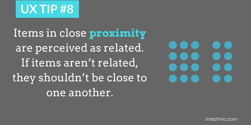
Research and psychology are constantly informing UX design principles, and a major part of design is establishing an immediate visual impact. One important part of that visual impact is the concept of grouping. Items in close proximity are perceived as related. If items aren’t related, they shouldn’t be close to one another. Don’t be afraid to use white space to indicate grouping.

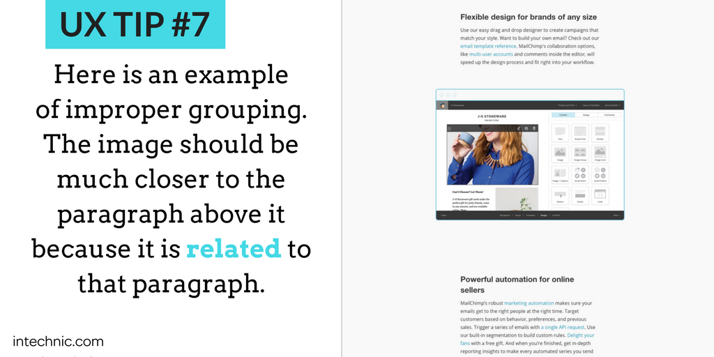
Look at the example above. The image should be closer to the paragraph above rather than the paragraph below. Why? Because it is related to the paragraph above. This is an example of visual grouping. Use the same strategy to group all other elements on your website: navigation menu items, header, footer, various information blocks, etc. This strategy is more effective than, say, drawing boxes around related content, which can clutter your design. Remember: less is always more and clarity protects your users from “cognitive bloat.” In other words, don’t make your users think or work too hard to figure out what is where on your website.

Takeaways
When it comes to successful UX design, don’t reinvent the wheel. Try to stick to widely accepted patterns as much as possible. Your users have established expectations, and they will be looking for patterns. Don’t be creative at the expense of those expectations because it will not produce a good user experience. As a UX designer, it’s your job to help and guide your users with strategies like effective use of affordance cues and visual grouping. Understanding how users interact with the world is the best way to become a better UX designer, and facilitating their interactions with your content is the pathway to success.


