I recently had an opportunity to lead several UX strategy and UX audit for one of the world's largest healthcare companies, so I wanted to share some of my findings and insights on the state of UX in healthcare website design in pharma and healthcare industry, as well as offer best UX practices.
The enormity of UX challenges in healthcare cannot be overstated. From the complexities of EMRs (electronic medical records) and legacy fragmented, disjointed systems, to regulation and lack of basic patient education and poor user adoption. In healthcare UX, the stakes are already high. With the COVID-19 crisis, even the smallest of UX issues in could translate into serious health risks; like the infamous case of accidentally sending an Ebola patient home because of a user error.
UX trends in pharma and healthcare industry
With the mobilization triggered by the COVID-19 pandemic, there is no shortage of innovation happening in the industry right now: wearables, data visualization, virtual and augmented reality, artificial intelligence, and so forth. But are we translating these technologies into better patient experience and ultimately better care for patients? After all, it is not about the technology, it's about how technology is used. "Used" is the keyword here: it all comes down to the user experience.
Empathy is the holy grail of healthcare UX
When it comes to improving user experience on healthcare websites, we must always begin with genuine empathy and concern for the patient. Navigating a new diagnosis and dealing with physical and mental health challenges can be draining for patients and their families. Empathy is the core of patient centricity. It is the Holy Grail in healthcare UX.
We define empathy as the experience of understanding another person's thoughts, feelings and situation from their point of view, rather than from one's own. Research suggests it is possible to boost the capacity for empathetic understanding, so we train ourselves to become better at it every day. The activities that always best help develop empathetic understanding involve user research: interviewing patients, getting to know their story and the impact their diagnosis has on their lives, as well as user testing; having real patients use your product or service and asking them to think out loud as they are completing basic tasks.

Highlight your organization’s tagline or mission statement by utilizing a Unique Selling Proposition (USP) right on the homepage. Tell the user how you plan to solve their problem and why you’re qualified to help. Invite the user further into your site with a drawing Call-To-Action (CTA).
Before designing or redesigning your healthcare or pharma website, make sure to capture the results of your research into user personas and user journeys. It is a great way to develop empathy and be able to relate to what users must go through daily.
Reach beyond patients; include caregivers and HCPs
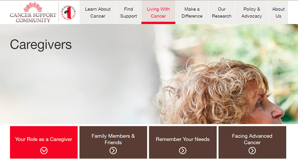
When we talk about UX in healthcare, everyone always talks about patients' needs. But what about those of their caregivers: spouses, family and friends? Caregivers are sometimes referred to as “secondary patients". They need and deserve the same level of experience and guidance through their often-difficult journeys. When conducting research or developing experiences for patients, especially with serious or chronic conditions, understand all your target audience types and don't underestimate the importance of providing supportive user experience to their loved ones.

Your site reaches more than just the patients of your focused condition – it will reach their caregivers, families, and anyone looking into the details of their loved one’s condition. Make them feel welcome and validate their experience by highlighting the caretaker’s journey, including their specific needs, problems, and struggles. Guide them to content explicitly for them.
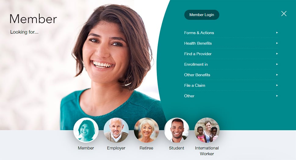
And of course, we can't forget healthcare providers, other medical professionals, and the importance of their user experience. After all, better UX for doctors, nurses and office staff, directly translates into better care for patients. One of the best UX practices for healthcare and pharma websites is an audience-based navigation for users to quickly find and discover the topic of interest based on who they are (personas for patients, caregivers and healthcare professionals) and how they go through their own journeys.
Focus on bringing real benefits to patients & HCPs
For a healthcare website to be truly user-centric and useful it must bring real value and benefits: saving time and effort, simplifying research and answering questions, providing valuable features. Which combination of these will depend on your audience and their unique needs (that's why personas and journeys are so important) but a good place to start are the following common practices:
- Curate and share the latest news, research, and innovation that puts the patients and HCPs in control.
- Promote findability and discoverability of information through maintaining best search UX practices.
- Don’t force patients or HCPs to register; instead provide value as soon as they arrive at the website.
- Tell stories, provide high-quality content, and encourage interactive explorations vs. “walls of text”

Entice users to become returning visitors or members by offering them unique, helpful features they can’t get anywhere else. We designed Diabetes Food Hub for the American Diabetes Association to be a “Netflix of recipes” for people with diabetes – a time saving feature they can’t find anywhere else. What would make your users’ experience a delight? How can your website add value?
Use audience-based navigation for patients vs HCPs
Clearly separate experience and content with the help of an audience-based navigation: Patients/Caregivers and HCPs. Consider setting up a separate site/subsite for each audience and make it easy to switch between them (HCPs often use patient sites as much as patients in order to explain information to their patient).
Prioritize and make it easy to access the following most important information sets; make it shareable, downloadable, and printable:
- For Patients: about the disease, about the solution/drug/benefits, treatment, risk/side effects, affordability, and other aspects related to patient care.
- For HCPs: dosing, safety, clinical trials, clinical practices guidelines, mechanism of action (MOA), prescribing information (PI) etc. - within the primary navigation and search.
HCPs are researching through dozens and dozens of options for their patients and are studying at a quick rate. They have a very high priority that these requirements are at the forefront of any site dedicated to them.

Every user has different needs, so their navigation should be catered to those needs. Orient your site’s navigation around your main target audiences and their common needs and problems. A ‘wizard’ or a digital assistant that collects the user’s interests (who they are, their needs, their situation) and uses these inputs to guide them toward the right information, landing page, or registration flow is a perfect way to “humanize the experience”. The wizard we designed above resulted in a 92% customer satisfaction rating.
Keep it simple: simple is better
Every time we conduct a UX audit or user testing on a patient-facing or an healthcare provider website, we always discover the same issues: the website results in a cognitive overload and is difficult to use. This is truly an industry curse. It may be counterintuitive, but best healthcare websites keep things as simples as possible for their users. Patients and HCPs alike are already experiencing information overload so anything you can do to SIMPLIFY their experience would be very welcome:
- Use simple terminology patient-friendly language, avoid using acronyms and clinical jargon.
- Improve text readability for an overall better user experience.
- Chunk content, include visuals and use simple language to maximize users’ attention span.
- Create memorable online experiences by prioritizing important information, reducing cognitive load and directing attention with colors and accents.
- Avoid running banners and promotional messages that result in banner blindness and get in the way of important information.
- Provide information in an easy to access fashion that allows users to skim imperative information via a synopsis or bullet points. Provide printable information as well.
- Visualize information and offer interactive tools (infographics/comparison tables/charts/dosing calculators, etc.); HCPs like tables of number crunching and patients like interactivity.
- Perform a content audit using the OUCH methodology (Is the content Outdated, Unnecessary, Current or Has to Be Written?)
- Prioritize scrolling over clicking.
- Ensure web accessibility and design for ADA (WCAG 2.1 standards).
- The website should offer color accessibility: there should be sufficient color contrast (for those with visual impairment).
- Videos should have closed captions (for those with hearing impairments).
- The website should be navigable by keyboard (for those with motor impairment).
- All images should have alt tags (for those with visual impairment).
- Text should feature a larger font size and enlarge easily (for those with visual impairments).
- Websites and videos should be listenable (for those with visual impairments or dyslexia in need of assistive technology).

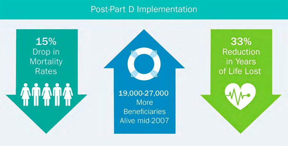
A picture says a thousand words, and an infographic is designed to show the user complicated data they wouldn’t want to read. Make the user’s research simpler and more enjoyable by presenting data in an interesting, eye-catching way that is also easy to digest. This will deliver the key points quickly and effectively and speak especially to patients who might be experiencing information overload.
Establish trust through social proof & data
When it comes to healthcare and pharma websites, trust is paramount. It is often a challenge since prospective patients and HCP's do not typically trust healthcare organizations and branded healthcare, pharma, and medical websites due to biases. The following recommendations will help earn a user's trust:
- Educate, don’t advertise! Convey a neutral, unbiased touch by minimizing promotional and marketing messages and campaigns.
- Link to full clinical studies and case studies and cite reliable sources to reinforce that medical expertise and other site content represents objective scientific data.
- Establish an emotional connection with users by using images of real people and their faces and leveraging psychology of colors and shapes.
- Inspire strength and endurance. Show empathy in recognizing their condition and the struggles that come with it and an equal dose of motivation to bringing up the patient’s mood with optimism. Finding balance is key!
- Create a sense of community and encourage participation.
- Provide social proof through testimonies from real patients, caregivers and healthcare professionals.
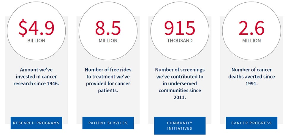
- Offer key metrics and data as opposed to self-proclaimed statements.

The proof is in the numbers. Show your user why they should see you as the authority in your field through metrics, KPIs, and factoids of success. Quantifying results will prove you’re genuine and transparent about your organization’s goals and how they’re achieving those goals.
Next steps: start with a UX Audit
No matter how good your product or service is or how beneficial it is to the wellness of people, a successful outcome largely depends on user adoption, ease of use, and the correct application, while guiding, educating and empathizing with patients, their caregivers, as well as their health care providers.
Not sure how your website is performing? Are you noticing symptoms of poor UX on your website? Don’t waste time and money going back and forth with tweaks and changes. We can help identify UX problems on your website and fix them with a UX Audit designed specifically for healthcare websites!
Remember, designing a healthier tomorrow starts with a good user experience today.


