

Historically, insurance is one of the most confusing and complex industries out there. This led to the development of the agent-centric sales model commonly used by the industry. However, in recent years, insurance agencies have been forced to adapt to changing preferences; a recent study covering much of the European market found that over 40% of home and vehicle insurance was ultimately purchased online and that number is growing every year. One thing is clear – people want self-service in the insurance industry, and almost all of them begin the process with researching online.
This sea change in the industry has left many of the older players adrift; capturing the attention and business of newer customers requires delivering a superior user experience to them, which allows them to navigate the process at their own pace and on their own terms. Many startups currently disrupting the insurance industry recognize this and work hard to create an online funnel that helps users successfully self-service.
Today, we’re going to look at some of the most common symptoms of a poor user experience on insurance and InsurTech websites and discuss how to fix them.
Why Do So Many Insurance Websites Struggle?
In a word: inertia. The insurance industry as a whole has long been governed by a relatively rigid series of principles, which has led to a certain way of doing business that just doesn’t match up with the current trend in consumer taste towards research and self-service.
Historically, it was the immense complexities of insurance in general that gave rise to the agent-centric model. You simply had to have an expert right there on hand to explain things to you and answer your questions, or you could easily become too confused to purchase the right product for your needs.
The websites these insurance companies use all too often reflect their 100+ year histories and their dated way of doing things. This leaves their largest key demographic out in the cold, as these sites just aren’t suited to facilitate individuals researching on their own and attempting to self-service.
Insurance execs do the staring contest: what are others doing? Many are reluctant to make changes before the competition. Jamie Yoder, Global Insurance Advisory Practice Leader, PWC
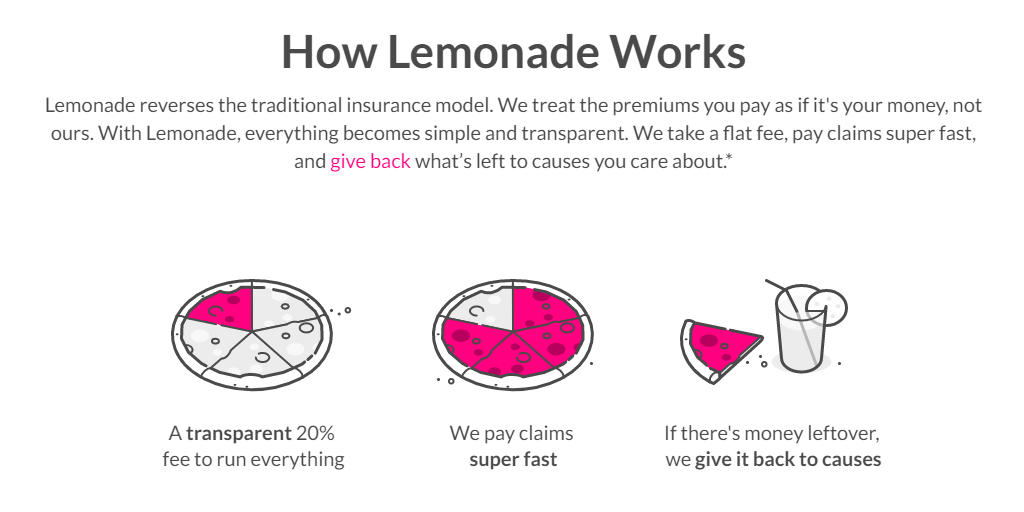
Newer entrants to the market created from the ground-up with a user-centric focus rather than an organizational-centric one – Lemonade is a great example in this regard – are finding great success by taking advantage of this industry-wide tendency to sit on the fences and watch what others are doing, rather than adapting with the times. Our recent rating of the world’s best insurance and InsurTech websites contains many new players that are disrupting the industry.
What Do Insurance Customers Want?
In order to provide customers a positive user experience, you first have to understand what they desire. When it comes to insurance, customers largely want three things from websites:
- Ease – Let’s face it; nobody enjoys spending their time on insurance websites. Get visitors in and out as quickly as possible, and they will appreciate it.
- Choice – Users need to feel in control of their purchasing and decision making process, and be presented with the right options to feel that they are getting good coverage at an acceptable price.
- Advice – Users are likely going to need some level of guidance and reassurance during the purchase process for something as complex and important as insurance.
If Your Website Has the Following UX Issues, You Are Losing Business
Recently, we studied several hundred insurance and InsurTech websites in an attempt to identify the most common issues they faced. Remarkably, over half of these problems are quickly identifiable on the majority of the sites in the industry.
Organization-Centric Information Architecture and Navigation
The number one user experience issue with most insurance websites (particularly the larger ones) is that they mirror their actual organizational structure online, making their websites unnecessarily complex – and largely pointless for customers. Site visitors don’t care what department or branch of your company services their product and don’t want to have to navigate around looking for it; they simply want to visit, find the information pertinent to their situation, and get out - quickly.
This organization-centric menu results in users spending more time trying to find what they are looking for.
The best way to deal with this is by conducting a thorough content and UX audit of your site and designing a navigation experience for visitors that is user-centric. Dispense with the jargon and speak to users with the language and terms they use.
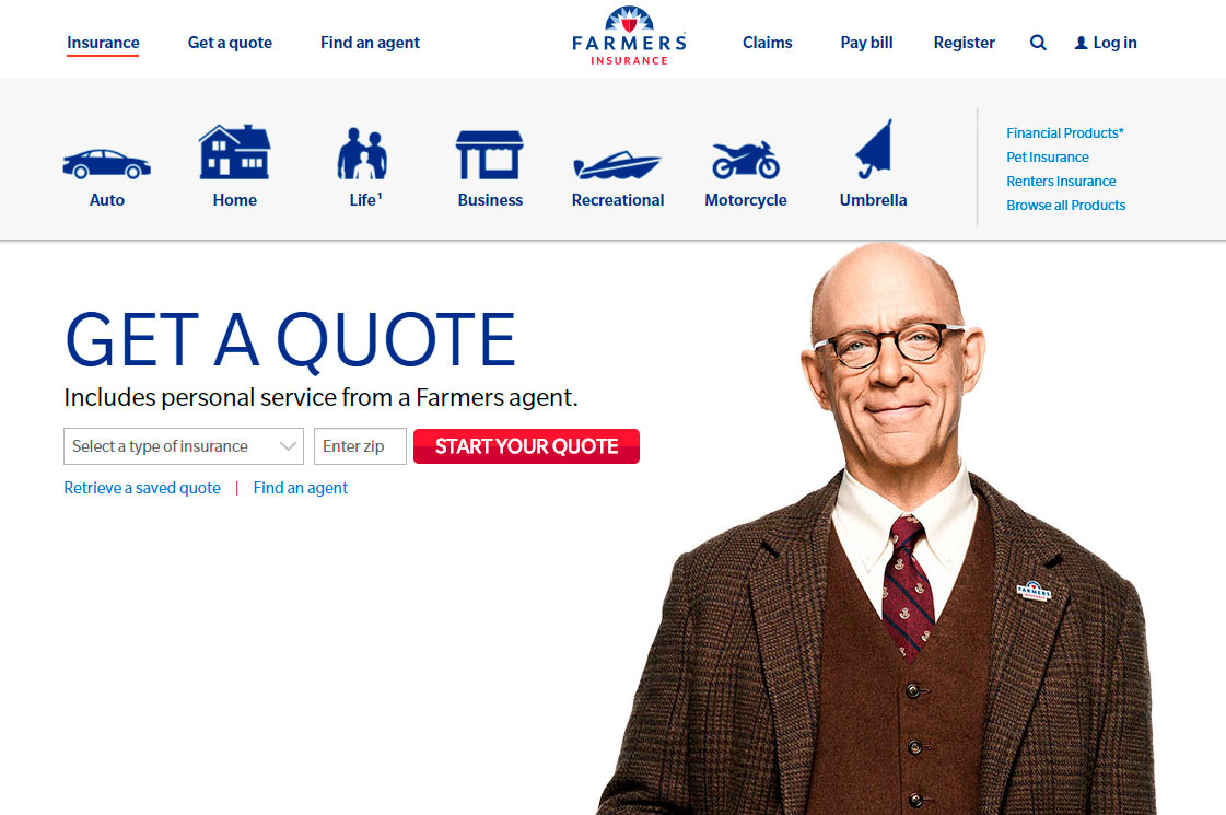
This menu is split up by audience-based groups. Users will spend much less time finding what they are looking for compared to more organization-centric menus.
Another strategy to consider is audience-based navigation. To implement this, segment your site based on who is visiting it. Members, employers, agents, businesses, and individuals can each have their own customized experiences, reducing the amount of clutter on your site and making it dramatically easier for people to find pertinent information.
Digital Experience that Can’t Replace the Human Touch
Your website will always fail if it can’t provide information to people more quickly and more easily than they could obtain it by picking up the phone and calling their insurance agent. Too often, insurance companies treat their sites as gigantic content libraries, leaving the responsibility of navigating their Byzantine pathways to users, who are provided with very little guidance.
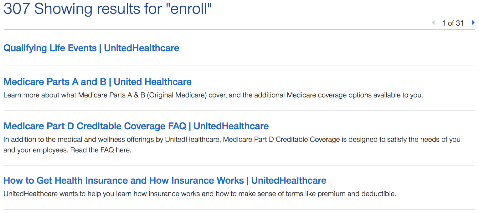
These search results do not clearly differentiate all the items shown. This makes the user experience more overwhelming because users now must sift through many pages of results.
Solving this issue requires that you begin to view your website as something more than a content portal; consider treating it as a virtual agent of sorts, who has the responsibility to help visitors quickly identify their needs and then help them navigate to the appropriate information or forms. Wizards and chatbots are excellent tools in this regard – expect to see even more of them in the future as AI continues to develop.

This website uses a wizard to narrow down which forms are shown to the user to complete enrollment.
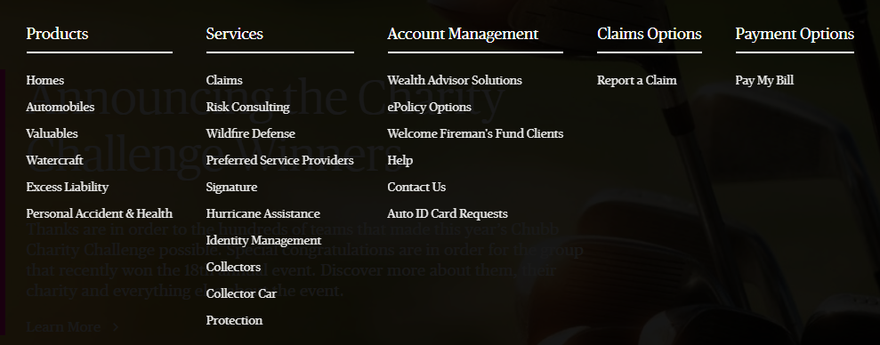
Templatized Content That Nobody Cares About
Another common issue faced by insurance and InsurTech websites is the proliferation of templatized content, much of which provides an absolutely horrid user experience. This is particularly true of larger insurance providers, many of which have created site architecture that features hundreds or even thousands of pages, all with near identical formatting and layout. 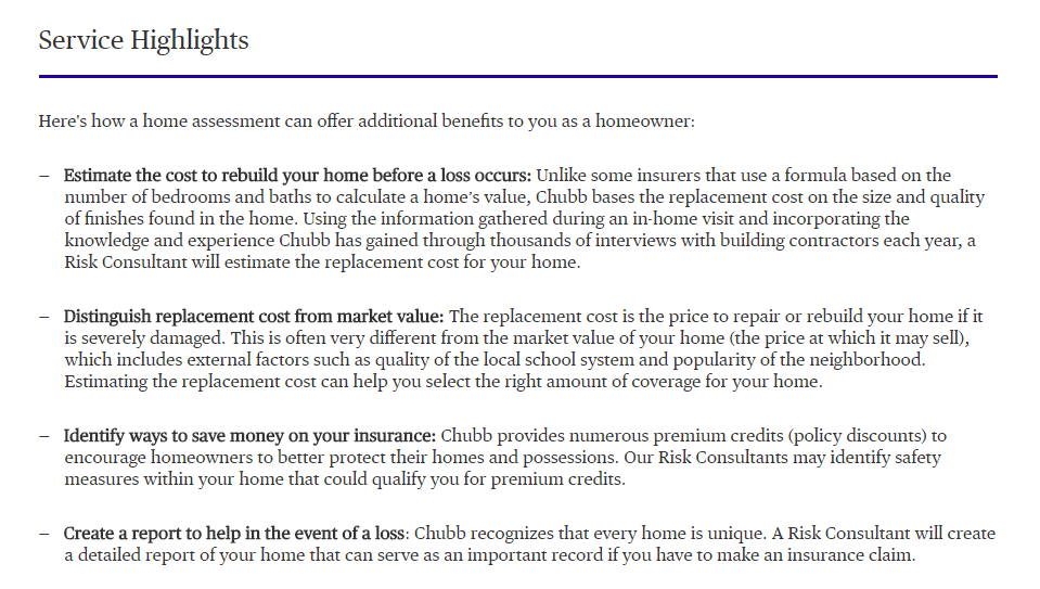
Text heavy pages like this one result in overwhelmed users who are less likely to comprehend the content.
In addition to being extremely confusing from a navigation standpoint, most of these templates don’t follow any of the traditional best practices when it comes to improving text readability, making engaging with them difficult, and even more boring than necessary.
Many of them also fail to apply the basic psychological principles necessary to attract the initial attention of site visitors, or hold on to their attention and keep them actively engaged long enough to deliver messaging effectively.
This website takes a storytelling approach that helps readers extract meaning from content that would otherwise be hard to understand.
Lack of Choice & Transparency
Customers need to feel that they have control over the process of selecting their insurance products, and that they are choosing the best coverage at the best price for their needs. Many insurance websites do a poor job providing this experience to visitors; not only do they fail to convey relevant information to visitors as discussed above, but also they fail to provide a clear and transparent comparison between potential alternatives.
Since this plan description is long, confusing, and full of jargon, users will have trouble processing and understanding it.
This side-by-side comparison is one of the most important tools potential customers are looking for, but instead they frequently are directly towards long, ambiguously worded product descriptions, so full of jargon they require a glossary and dictionary to interpret. Ultimately, this provides them little to no useful information and it frequently drives them off the site entirely, in search of a solution which provides them the information they are looking for.
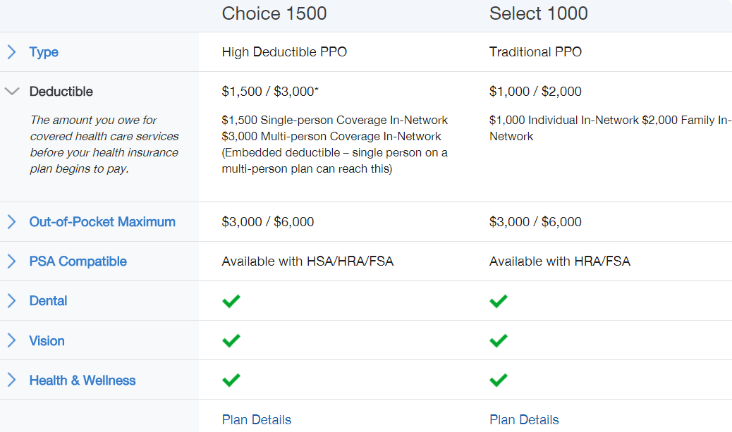
This plan comparison uses an easy, clean layout that helps users understand the differences betweens plans easily.
Fragmented and Disjointed Legacy Systems
Due to the history of the industry, insurance companies are frequently burdened with a variety of disjointed systems that can negatively impact user experience. It is not uncommon to find companies who are effectively operating multiple sites, complete with entirely different URLs, branding, and structure.
Expecting users to navigate through one system to pay their bills, another system to file a claim, and a third to get a quote is a complete mess if you’re looking to deliver a superior user experience. Visitors shouldn’t have to pay the price for your messy online ecosystem.
Provide one, centralized website or portal that allows users free and complete access to all functions of your site. The magic of so-called “single sign-on” technology can even be extended to your partners or third party providers once integrated.
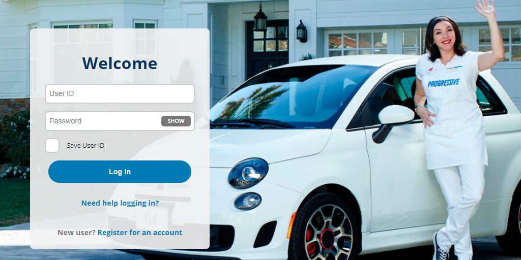
This website provides users with one, centralized login to access all the information and services they need.
A Time-Killing Wasteland Filled with Forms
If you asked people what they least liked about the process of purchasing insurance, you would likely hear one phrase repeated over and over – “I hate all those forms!”
Unfortunately for most insurance companies, their websites do little to alleviate this pain point for users. Many companies even go so far as to collect all of their hundreds of forms together, sticking them all in a “forms library”. A user looking to do something simple, like enroll, would then be expected to download half a dozen or more documents, read the instructions for each to determine if it is the correct document, and then deal with submitting them.
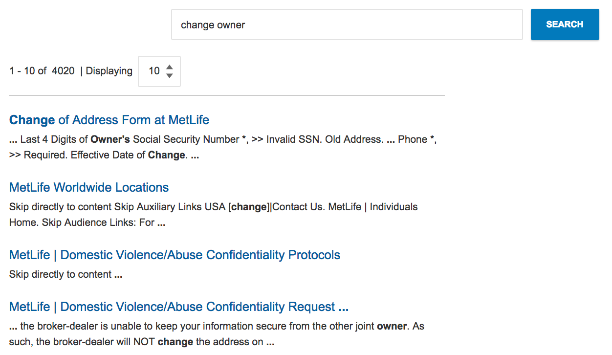
Websites like this force users to search through, download, and open many forms resulting in longer sessions and more frustration.
Your website should make it easy for people to find the specific forms they need without all the song and dance. Create a user experience that helps funnel them to the appropriate places, based on who they are and what they are attempting to do, and consider simplifying your documentation process by converting to electronic filing.
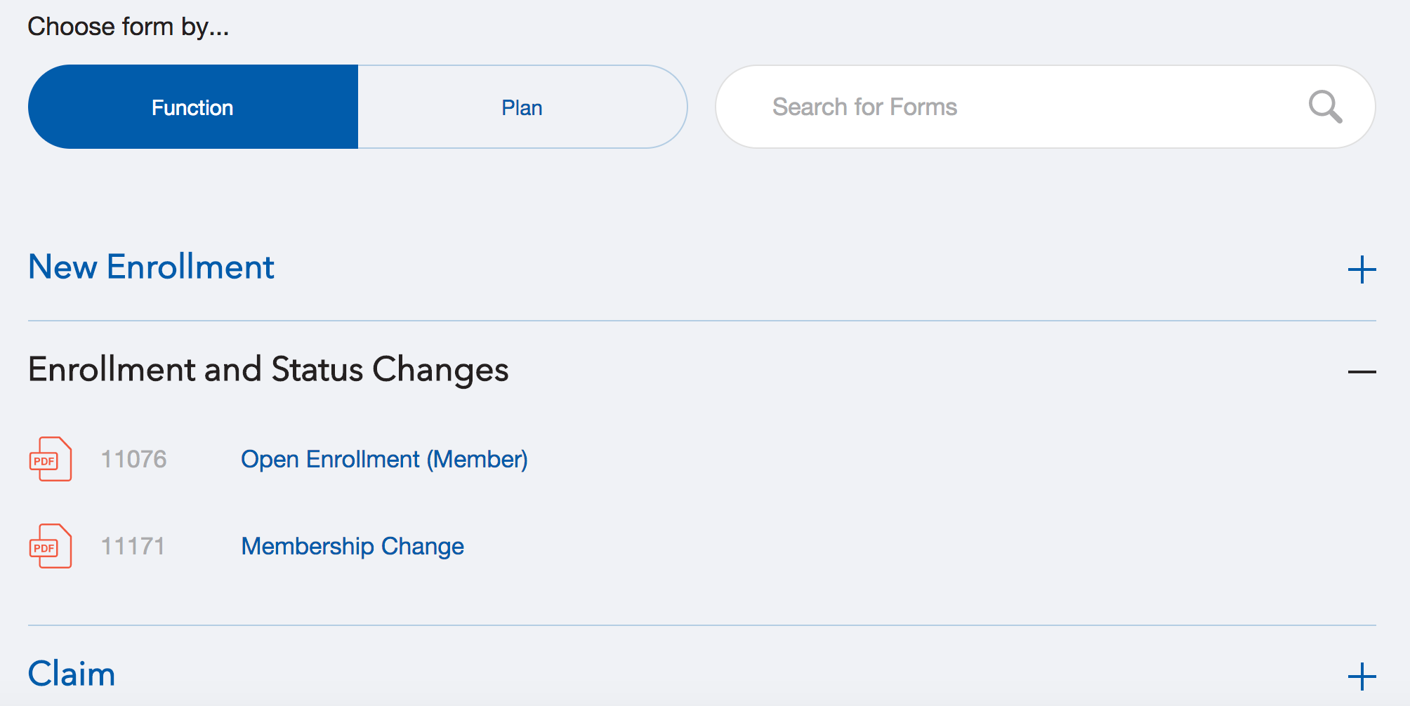
Websites like this allow users to find the exact form needed to complete tasks, resulting in easier and more organized experiences.
Tactics Designed to Artificially Create Friction
At a recent conference, I overheard two executives from major, well-known insurance companies privately boasting to one another about how effective they were at artificially inflating the difficulty of their claim process.
This demonstrates how utterly disconnected with the actual needs of their user base many of these older organizations are, and provides another in way in which newer, more agile companies focused on providing a superior user experience are able to effectively attack these businesses.
Remember that when the time comes for someone to actually file a claim with your company, the ease or difficulty of the process (or even the perception of it) will likely inform their opinion about your entire organization.
Breaking Common UX Patterns
While many of the most common issues with insurance websites are most egregiously practiced by the older companies which operate in a more traditional manner, this is one problem that is definitely much more common with InsurTech startups and newer market entrants.
Basically, some companies are getting a little too creative and innovative for their own good in terms of web design, in an attempt to one-up the competition. This had led them to violate some of the most important industry best practices regarding good UX – it’s just as possible to confuse visitors by playing far too cute with essential site elements, like navigation, as it is to bury them in an unnavigable pile of files and forms.
.png)
This website violates best practices because the navigation menu changes as users navigate the website. This makes it difficult for users to keep track of where they are relative to other product and services pages.
Instead of falling into the trap of over-development, focus on creating a positive and memorable user experience that delivers what your visitors actually want without needlessly confusing them.
The Time is Right for a New Approach
While we have spent most of this article pointing out common problems that insurance and InsurTech websites face, the very fact of their near-ubiquitous existence also serves to illustrate a huge opportunity – insurance companies are better positioned than most to take advantage of good UX in order to increase business.
Very few participants in any insurance market have achieved the perfect balance of good informational architecture, easy-to-use navigational features permitting self-service and research, and a customer-centric UX necessary to serve the changing demographics and demands of their customer base.
Remember, good UX is good business. It is not, however, developed in a vacuum. It requires repeated testing and research, and in most cases a perspective outside your own, unhampered by the institutional biases and prejudices of your industry.
If you’re interested in learning more about how a UX audit and overhaul can dramatically improve the online performance of your insurance business, contact our team of experts today to schedule your consultation.