


I've worked with many manufacturing companies, around the world, on improving the UX of their websites. Over the years I've identified multiple common user experience mistakes that manufacturers often make on their websites. This applies to manufacturers across the entire spectrum: automotive and heavy machinery, to electronics, construction, food and beverage.
Below, I’ve outlined some of the common mistakes to avoid on manufacturing websites with recommendations on how to fix them:
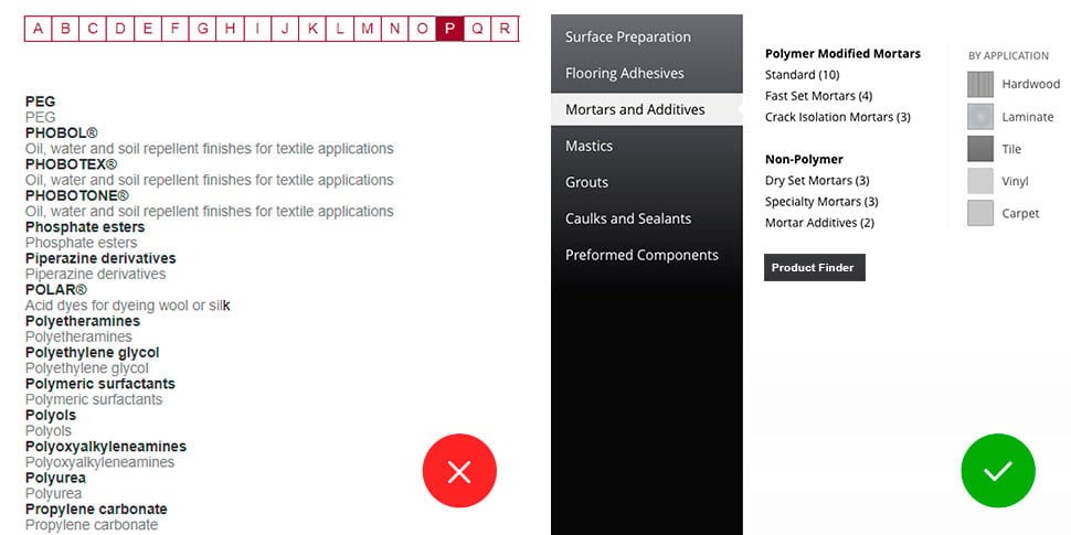
1. Product catalogs that suffer from poor product findability
Don’t recreate the linear version of your paper catalog.
Do reveal the entire scope of the products and services offered using a multi-dimensional taxonomy (by category, by industry, by application, etc.). Use the product finder (guided experience) to help users find the right product for them.
The most common mistake I have found is assuming your clients know and understand the full range of your products. Most manufacturers' online catalogs essentially mimic their paper catalogs, which are organized in a linear fashion. Users are first required to pick a product line or category, then subcategories, and only then be able to find SKUs. This structure is not user friendly. Many times, users don't know where to start and end up in wrong categories, forced to go back and forth between pages, until they end up in the right place.
Your digital catalog doesn't have to resemble a catalog. This is a self-imposed limitation. Instead of throwing everything at your users, consider asking them questions and offering guidance; helping them select the right product by factoring in their need, application or any number of useful parameters. This is something that a catalog cannot do but your website can and should.
By humanizing the experience, not only you will save users time and clicks but it will also provide reassurance they have found the right product and you are the right company for them.
2. Product search that is not forgiving
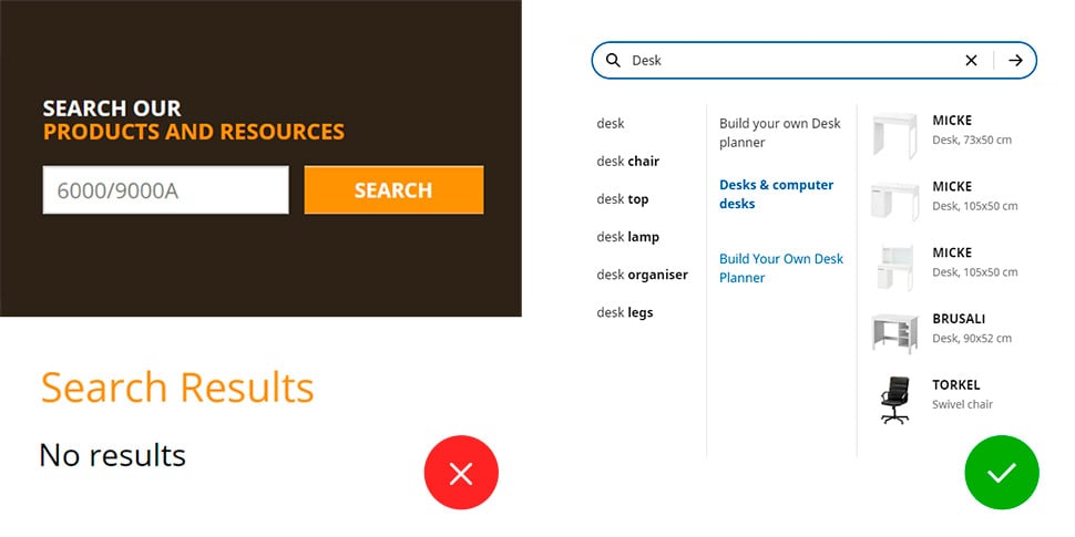
Don’t expect that your users know the exact queries (or SKUs) for search. Don't return "No Results".
Do make the search more “human” and forgiving. Use effective auto-suggest; look for important keywords and predict results. Offer suggestions (matching content, contact support, view sitemap, etc.) if exact match is not found. Avoid dead ends.
When users can’t find the right product by browsing, or when they know exactly what they are looking for, they’ll often resort to search. Many users prefer to search over browsing, as it could be much quicker and more efficient.
The problem: Most searches on manufacturing websites are not user centric. They typically require you to know the exact spelling or product SKU, instead of inputting a general contextual query like “replacement part for XYZ” or “new model of ABC”. The search is often not forgiving; it implies that your customers know the exact spelling of your brands and SKUs. We recently witnessed a user spend over 20 minutes struggling to find the right product simply because she misspelled the product brand name by one letter!
A better approach is to offer semantic search, looking to understand the true meaning and the intent of each query. Autocomplete (or suggestive input) allows users to select from the dropdown, requiring less typing and more accuracy. The best way to improve search is to review your website’s search logs on a regular basis and try most common search queries to ensure that they produce useful results. Please see the article Search UX Tips and Design Guidelines to Improve Search Usability to find more detailed recommendations.
3. Returning irrelevant search results
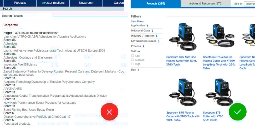
Don’t burry your products with the rest of search results.
Do prioritize search for products. Offer to filter out search results to easy narrow down to the specific content type, as well as allow to change sorting results, where applicable.
The second most common UX mistake occurs when a user has entered their search term into the search field. The results typically yield a hodgepodge of products, press releases, documentation, articles, blog posts, website pages, etc. This hodgepodge is presented as one long list, without any reasonable classification, or possibility of sorting through (and filtering out) the less relevant results. The user gets confused, because they are not sure which link to click to reach the information. In a recent user test, we observed the user getting stuck in press releases while trying to find basic product information – a task that should be easy to execute.
A simple solution to this problem: Allow filtering the search results by type, so a user can, for instance, only toggle the “products” button, thus hiding web pages, articles and documentation. And, of course, search results always prioritize products before other secondary information.
4. Product spec sheets that are difficult to find
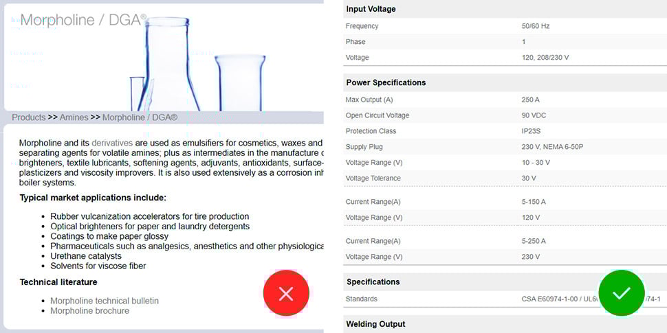
Don’t hide important technical information (specs, PDS, SDS, etc.) inside downloadable files (PDFs).
Do prioritize this information and make it easily accessible: organize technical information in easy-to read tables and tabs. Offer easy comparison between products.
Another common mistake: Making product spec sheets difficult to find. When the user finally finds the product they’re looking for, they are often uncertain if it’s the right product, and resort to comparing products side by side. For some reason manufacturers love to hide important product information: spec sheets, PDS, SDS, etc. They are usually impossible to find. For example, on one website it took us 7 clicks to get to a product data sheet!
We witnessed users in user testing writing down important product information – it is often so difficult to find they are afraid to lose it! So now in addition to a paper catalog you also need a pen and paper to write things down. On a website! How silly is this?
Avoid this common failure point by allowing easy side-by-side comparison between products using the most common product specifications and criteria. Lay them out in easy to scan and process bullet-points. Lay them out in easy to scan and to process bullet-points. Please don’t upload 50 page PDFs for the entire product line – this will make important information even more difficult to find, as the user first has to find the product, and then the specification for that product within another lengthy document. This drives users absolutely crazy!
5. Friction to purchasing or requesting information
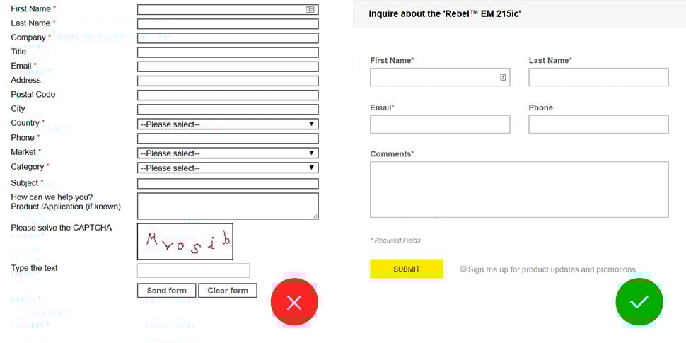
Don’t make it too difficult to request information about a specific product.
Do minimize the amount of information you are collecting on the inquiry form. Forward the request directly to the sales rep, distributor or rep who can help. Include the information about the product.
The user finds the product and confirms that this is indeed the right product for them. Now what? Manufactures often rely on distribution networks to sell their products. Connecting buyers with distributors is where many websites fail. The next logical step is guiding the user toward purchasing the product: whether direct, requesting information, or directing them to a store or distributor, the experience must be as seamless as possible.
Unfortunately, this is often not the case. We see websites where users can only request information about one product at a time, have to reenter or retype repetitive and redundant information, or even figure out which department to contact (speaking of an organization-centric experience!)
Do this exercise: the next time you buy anything on Amazon, compare that experience to the one where you connect the buyer on your website to one of your dealers, distributors or retailers. Forget the transactional component of Amazon just focus on the UX. You probably wouldn't even notice if the order is fulfilled by Amazon, or one of their independent sellers. That's how seamless their UX is. They work out all the logistics in the background. They get users quickly through the process: from wanting the product to getting the product.
6. Difficulty in finding a local distributor
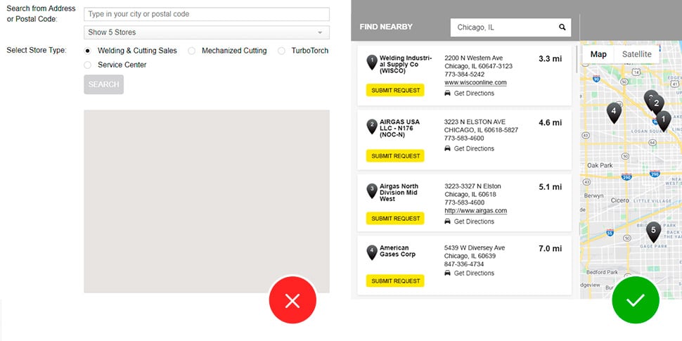
Don’t make the user enter their location before showing anything in the distributor locator.
Do automatically default to the user’s location (resolved through their IP address and/or GPS) and suggest the closest distributors. Eliminate any unnecessary steps.
When a manufacturer has multiple dealers or distributors, it is crucial to have a locator that displays locations within proximity to the customer. This is another common friction point. We see dealer/distributor locators that require multiple unnecessary clicks and steps, ask for redundant information, and provide inaccurate or confusing information.
Building a locator takes a lot of careful consideration and precise attention detail. Otherwise, potential clients would be lost not only on the website pages, but also when it comes to making the order.
Some of the best practices include: Automatically determining the geolocation of the user (either through GPS or IP address) and suggesting the closest location to them, while providing the user with all pertinent information (including help if there aren’t local distributors).
Good UX is always good business
A well-designed manufacturer’s website should be like a yellow brick road. It should guide you toward your destination, no matter what. There should be no dead-ends, no friction, no obstacles. If you've never seen your actual customers interacting with your website, you may be in for a surprise. Talk to us if you’d like to get a better idea about how your customers interact with your website and remember, Good UX is Always Good Business!