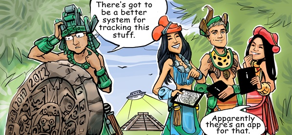
 Update: see our 2014 Web Design Trends & Predictions Since the Mayans were wrong about the world coming to an end, you better start paying attention to evolving web design trends that will have a major impact on your website in 2013. Every year, we make predictions about innovations that will carry enough weight to change competitive landscapes. Below are our predictions for high-impact web design trends in 2013:
Responsive & Adaptive Web Design
This relatively new approach to web design allows building websites that are optimized for screens of all sizes: small mobile devices, tablets and large desktop monitors. Unlike the traditional approach of building two versions of the same website (a desktop and a mobile), responsive and adaptive websites automatically adapt to the screen size and capabilities of any device. The cost benefits are clear: one version of the website to build and to maintain.
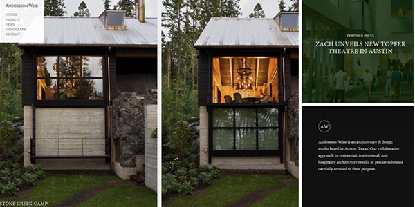
Andersson-Wise - this architecture & design studio's website just says ‘good design’ whether you look at it on your iPhone or a desktop computer.
So what’s the difference between Responsive and Adaptive Design? Unlike Responsive Design (which simply adapts to the screen size), Adaptive Design utilizes sophisticated auto-detection scripts to accurately identify each device and to make full use of features available, such as a built-in GPS or ‘touch & tap’ capabilities.
Parallax & Vertical Scrolling
Parallax websites will become much more common in 2013. Parallax is a technique achieved with multiple layers of a website that are scrolling at different speeds, creating an illusion of a 3D effect. This looks great on mobile devices and works very well for micro sites or product presentations.
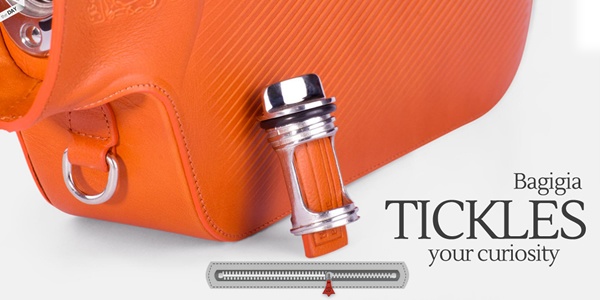
Bagigia is an amazing example of how parallax and vertical scrolling are used to create an unforgettable experience for a tangible product. Here are some other best parallax examples.
Another popular technique (often combined with parallax) is vertical scrolling of menus and buttons, where navigation or functional elements stay locked in their positions as you are scrolling the page. An example of that are social buttons on the left side of our blog and the navigation menu at the top of the page. Both are all is easily accessible, regardless of where you are on the page.
Minimalism – Simpler Is Better
The best thing about minimalist (simple) website layouts is that they challenge you to throw away what’s unnecessary. Simple design is better because it is more effective in communicating important messages without the “noise”. Expect to see simpler one-color icons, text-based navigation, and LOTS of empty white space.
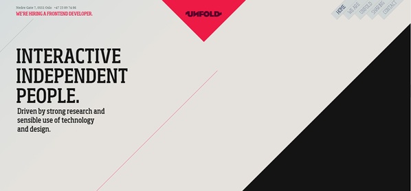
Unfold - an independent digital agency in Oslo, Norway, featuring minimalistic design putting parallax effects to great use.
Designed Typography
The days of Arial and Verdana are long gone. In 2013 you can expect to see more websites using creative and unique fonts. Typography is becoming an integral part of any web design project and the use of custom fonts will be an essential creative asset, contributing to the overall identity of a website as much as other important elements such as colors or artwork.
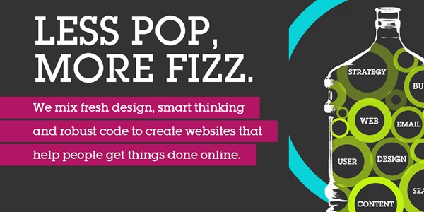
Moresoda - a UK-based design studio’s website showcases impressive font work.
The End of Flash
Adobe Flash is no longer the king of animation and interactivity. While there are still many legacy websites making use of Flash, in 2013 we will see that number dwindling. We predict an ever growing number of websites proactively replacing Flash with JavaScript, HTML5 and CSS3 for dynamic and interactive experiences that work universally well across platforms and don’t require any special plug-ins or software.
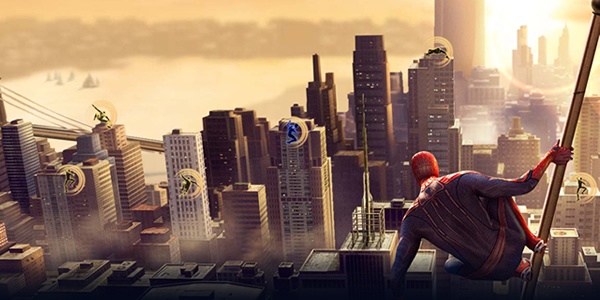
The Amazing Spider Man Game site is a great example of an HTML5 website that could only be previously done in Flash.
Skeuomorphism. Skeuo…What?
Steve Jobs famously asked designers to capture the look of a real life leather bound calendar when designing the iPhone calendar. This approach is part of the reason that Apple products feel so natural and intuitive to use. In the context of design, Skeuomorphism means making elements look like real world objects and this approach is making its way to the Web. In 2013 you can expect to see plenty of real life objects: post-its, tabs, wooden textures, sheets of paper and even human body parts that will make your online experience more realistic.
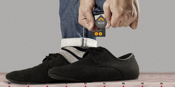
Lend Your Leg – a website to raise awareness of landmines. Very effective use of skeuomorphism to deliver a powerful message.
Full Page Backgrounds
The popular trend of full page backgrounds will continue into 2013. Expect to see websites using high quality photographs and artwork to create the initial “eye-candy” impression and leave a long lasting visual impact. “The bigger is better” approach will also be applied to image galleries, portfolios and photos of merchandise sold online.
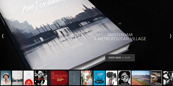
Mendo – a Dutch store for book aficionados. What an amazing way to sell books online!
Custom Photography & Illustrations
Nothing makes your website stand out better than professional and authentic images, including original photographs of your employees or team members, captivating images of your building or facilities, pictures of your customers using your products and custom illustrations and designs. In 2013, expect to see more use of custom images and less of the same cliché stock photos you see being used over and over on websites today.
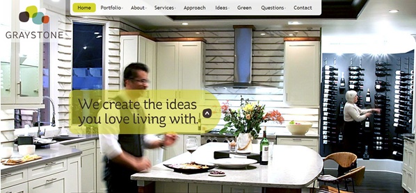
Graystone – an effective use of custom photography by this company specializing in interior renovations.
Videos for Effective Communication
Integration of videos on websites will continue to change the way websites communicate important messages. Website visitors in 2013 will expect to get the information they need by watching videos instead of reading text. Videos capture and engage audiences, and help communicate important messages. Expect to see more videos on websites next year.
Intechnic - who says business videos should be boring? Our own corporate video is fun and exciting to watch and the voice behind it is Kurt Kelly, the famous voice of Hollywood movie trailers.
