

Andrew Kucheriavy
Color is one of the most powerful tools available to a UX designer, and a topic that will certainly generate some lively debates among graphic designers. The importance of color choice in UX design goes much deeper than simply choosing an aesthetically-pleasing palette. In addition to applying color psychology to influence website users, designers must also account for the way our brains see color, the way color affects usability, and the cultural connotations of color.
 Color is one of the most powerful tools available to a UX designer, and a topic that will certainly generate some lively debates among graphic designers. The importance of color choice in UX design goes much deeper than simply choosing an aesthetically-pleasing palette. In addition to
 Color Combinations Can Make Your Designs Easier (or Harder) to View
Have you ever visited a website and marveled at how well the colors complement each other, providing just the right amount of contrast? That effect was likely intentional. Color value plays a significant role in readability and user experience. Every color has a value based on its location in the color wheel that determines how well it works with other colors. Overlaying colors on opposite ends of the color wheel can make reading easier – especially for users reading on a smartphone screen in bright light outside. On the other hand, placing text over backgrounds with similar color values can make reading more difficult.

When designing a color scheme for your website, there are some color combinations that you should avoid. Have you ever looked at an image, and certain colors appear to pop out of the screen? This effect is called chromostereopsis. This phenomenon creates the illusion of depth in an image or text, and this effect can create fatigue. The brain experiences chromostereopsis with certain color combinations, particularly blue and red, and it can create a cringe-worthy effect in web design – just take a look at the example below. Here are some simple design tips to help you use color effectively in web design:
- DO overlay colors with varying values for readability.
- DO use backgrounds with consistent color schema.
- DON’T overlay light-on-light or dark-on-dark.
- DON’T use neon or rainbow designs.

Account for Color Blindness in UX Design
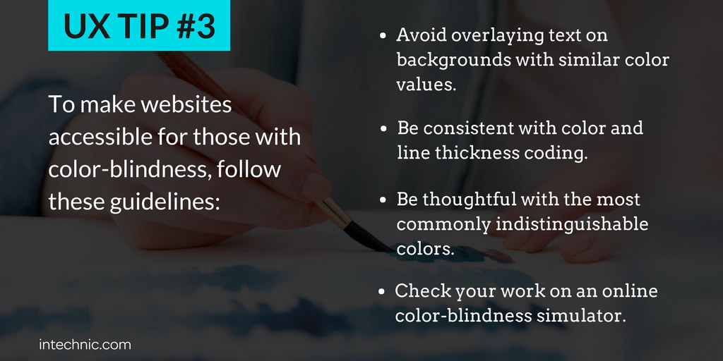
One particular challenge that UX designers face is accommodating visitors with color blindness, or color vision deficiency (CVD). This common condition affects more than eight percent of men and about 0.5 percent of women of Northern European ancestry. With such a high prevalence of CVD, it’s up to UX designers to employ color blind-friendly palettes tailored towards the multiple varieties of colorblindness. In some cases, individuals cannot decipher between red and green, while in others, blue and yellow appear the same. In very rare cases, individuals may perceive no color at all. Here are some useful tips for creating color blind-accessible designs:
- Avoid overlaying text on backgrounds with similar color values. While this causes difficulty for most readers, individuals with CVD may literally be unable to read text on backgrounds with similar color values. In other words, your web page may just look like a plain block of color with no text. This doesn’t mean that you can’t necessarily use the color combination you want, just make sure to adjust the color values so they are adequately distinct.
- Be consistent with color and line thickness coding. One way to improve accessibility is to provide users with multiple ways to understand your content. For example, if text or figures on your website are a consistent color, choose a consistent line thickness as well. That way, even if someone cannot distinguish that particular color from another, they will still be able to understand your schema.
- Be thoughtful with the most commonly indistinguishable colors. The more you know about your users’ ability to absorb your content, the more informed choices you can make about your designs. Avoiding website designs that would be difficult for someone with blue-yellow CVD, for example, helps you reach more users and improve your overall accessibility. A good general tip is to avoid designs that rely heavily on the colors red, green, and blue.
- Check your work. For those who do not have CVD, it can be difficult to try to guess what a design might look like. Fortunately, there are websites, like Vischeck, Colorblind Web Page Filter, and Coblis, that can show you how they display for individuals with different types of color blindness. Colbis even offers designers the opportunity for someone with colorblindness to check the readability of your designs to ensure your designs are accessible.
Build Color Designs with Culture in Mind
Understanding the way human brains physiologically interpret color is just one piece of the puzzle for UX designers. Aside from the biological aspect, culture and context also play a huge role in the way your users experience and react to color. This concept can be more complex to apply, because unlike red-green color combinations which are jarring to virtually every viewer, colors can carry significantly different meanings in different cultures. Knowing your users’ cultural heritage is crucial to creating an effective web design. Yellow may create a warm, friendly feeling in the US, but implies betrayal in France, pornography in China, bravery in Japan, and luck in Thailand. The color violet can indicate royalty among Westerners, nobility for Chinese viewers, and mourning for Brazilian culture. It’s a good idea to know these cultural cues research before you start designing. Consult this overview of common color meanings for different cultures to ensure you don’t make any regrettable mistakes. Using color effectively can make or break your user experience. Understanding color in different contexts can help you avoid jarring designs, make your website more accessible, and resonate more deeply with culturally diverse audiences.
 Concerned that your website might be misusing color? Sign up for our UX Audit: