

Whether we realize it or not, the color of objects we see affects our mood in more ways than one. Extensive research has revealed that color affects not just our perception, but also our emotion and behavior. We know that written content and how it is presented is important, but what about what we are saying through design elements and other non-verbal content? A website might have content that is eloquent and clear, but the color choices for background and other elements could send a contradictory message. Many companies choose their colors based off of personal preference or the corporate logo, but fail to realize that the website says much more than what is presented on the conscious level. Design elements such as color choice that reach visitors on the subconscious level deliver just as strong of a message as written content. After all, what is the first thing a website visitor sees when they reach a new website? Colors, colors and more colors! Let’s take a closer look at what each color means and how even a change of color tone can change perception. Let’s also look at examples of some websites utilizing the psychology of colors to establish and reinforce the desired user experience.
 Whether we realize it or not, the color of objects we see affects our mood in more ways than one. Extensive research has revealed that color affects not just our perception, but also our emotion and behavior. We know that written content and how it is presented is important, but what about what we are saying through design elements and other non-verbal content? A website might have content that is eloquent and clear, but the color choices for background and other elements could send a contradictory message. Many companies choose their colors based off of personal preference or the corporate logo, but fail to realize that the website says much more than what is presented on the conscious level. Design elements such as color choice that reach visitors on the subconscious level deliver just as strong of a message as written content. After all, what is the first thing a website visitor sees when they reach a new website? Colors, colors and more colors! Let’s take a closer look at what each color means and how even a change of color tone can change perception. Let’s also look at examples of some websites utilizing the psychology of colors to establish and reinforce the desired user experience.
1. White
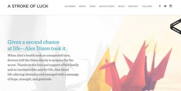
The color white reflects light, so it strains our eyes when looking at it. In business, white implies fairness and equality. The color white is associated with organization and equality. The website for the book "A Stroke of Luck," is a great example of the use of white to reinforce the concepts of fairness and equality.
2. Red
The color red increases the heartbeat and causes faster breathing. It is an intense and powerful color and as such, is associated with demand and aggression. Red is also known to stimulate our appetite. In business, red is known as a "call to action" color. The website for First Aid Dorset, an organization offering CPR classes in the UK, is a great example of using the color red to drive visitors to take action.

3. Pink
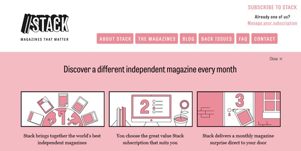
The color pink is a compassionate and nurturing color. It is a non-threatening color that calms and reassures the viewer. It is associated with love and romance. The website for Stack Magazines gives viewers a reassuring and calming user experience.
4. Blue
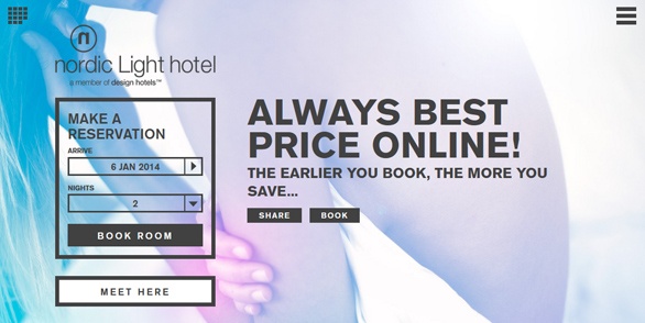
The color blue, in lighter shades, is known to have a calming and tranquil effect. Darker shades of blue stimulate the mind into thinking more clearly. But, these darker shades can also create feelings of depression and coldness for some people. The website for the Nordic Light Hotel is a great example of the use of blue to create a calming, peaceful user experience.
5. Green
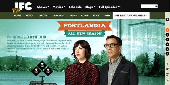
The color green is known as the easiest color on the eye. It has a relaxing effect. This is why, interestingly enough, people who are about to appear on a TV show, wait in a green room so they can relax before their appearance. The website for the TV show Portlandia is a great example of the use of the color green to create a calming sensation for the visitor.
6. Yellow
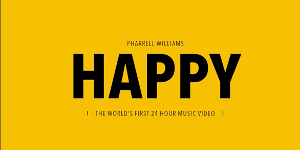
The color yellow screams for attention. It is known as the attention grabber! However, yellow is harshest on the eyes and therefore stimulates our emotional side. As a result, if you are going to use yellow as a primary color for your website, make sure you choose the proper shade of yellow so it lifts the viewer’s spirits rather than irritate the emotions! The website for Pharrell William's 24 Hours of Happy is a great example of using the color yellow to enhance a happy, uplifting user experience.
7. Orange
The color orange is associated with warmth and happiness. It is also known as an uplifting and optimistic color. It promotes conversation and just like the color red, orange stimulates the appetite! In business, orange encourages adventure and confidence. Check out how film production company Lucky Punk uses orange to build these emotions with its website.

8. Purple
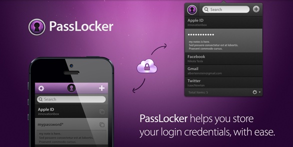
The color purple is associated with wealth and royalty. This color stimulates our minds and encourages intense contemplation. But, be careful as the wrong shade of purple results in feelings that what we are looking at is gross and cheap. Take a look at how Passlocker uses the color purple to stimulate vistors' thoughts about a sensitive topic.
9. Brown
The color brown is known to be a reflective color. Some people also find it to be a supportive color. Brown is associated with natural or organic things because people think of the earth and nature when they see brown. Australia based photographer, Kalon Edser, uses shades of brown to establish a natural, rustic experience for his photography portfolio.

10. Gray
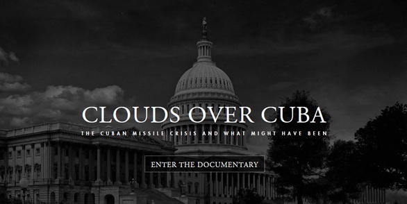
The color gray is quite interesting because it is one of the colors that result in no discernible psychological response. However, the lack of color and dullness in gray can be depressing. If the correct shade is not used, gray can have a dampening effect on the colors around it. The website for the documentary, Clouds over Cuba, is a great example of the proper use of gray in creating the right tone and user experience, given the subject matter.
11. Black
The color black is associated with authority and power. Black causes feelings of intimidation and control. In certain contexts, can also seem sophisticated and sleek to its viewers. The website for photographer Marcin Kaniewski is a perfect example of using black (and white) to create the feeling of sophistication. In fact, we see the use of black and white on websites as a major trend for 2014.

Now that you know what emotions colors invoke and how those emotions can enhance your website visitors' experience, here are a few things to keep in mind as consider design elements.
Gender Differences
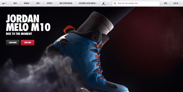
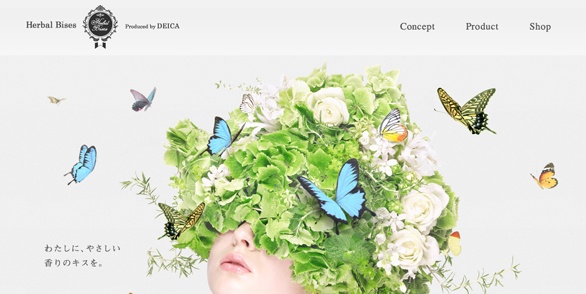
Depending on whether your website is targeting a specific gender or not, research has shown that women choose softer colors over brighter colors and men choose brighter colors over softer colors. Take a look at the different approaches and use of colors used by Nike and Herbal Bises to properly reach their target market(s). Jordan (by Nike)
Cultural Association
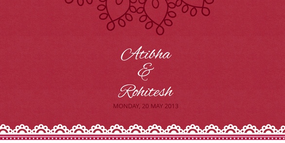
What we need to keep in mind is that not only personal preferences of colors come into play, but also cultural differences when it comes to the use colors. For example, white reflects light and strains the eyes. This is why white symbolizes purity and innocence; because of the “touch me not” message it gives our eyes. But in some cultures abroad, white symbolizes death! A prime example of the cultural difference in terms of colors is in Indo-Pak cultures, brides adorn red bridal gowns instead of white. The reason is only widows wear white in Indo-Pak cultures. This is how a color’s image and meaning is altered in so many different ways across the world. As an example of this, Indian newlyweds Athiba and Rohitesh used red, rather than white, as the primary color for their wedding website as this color is more related to love and weddings in the Indian culture than white.
This extensive research has helped numerous companies worldwide fine-tune their websites to achieve their business goals and draw in more clientele. Be sure that the colors of your site say the same things as your content. Colors should implicitly reinforce the message that the content is explicitly saying. So ask yourself, where does your website fit in? Does your website need a color or tone facelift?