

Most people know that the Internet is constantly evolving, but it’s become so much a part of our daily (hourly, uh… minutely?) lives that many of those changes go unnoticed. Today’s Internet is kind of like watching your child grow up – because you see them every day (we hope!), you don’t notice how much they’ve changed until you take a look at older photos and your eyes bug out. With that in mind, we thought we’d remind you how far web – and graphic design – has come over the last few decades with before and after pictures from some of the biggest and most well-known sites out there. Ready for some mind-blowing blasts from the past?
 Most people know that the Internet is constantly evolving, but it’s become so much a part of our daily (hourly, uh… minutely?) lives that many of those changes go unnoticed. Today’s Internet is kind of like watching your child grow up – because you see them every day (we hope!), you don’t notice how much they’ve changed until you take a look at older photos and your eyes bug out. With that in mind, we thought we’d remind you how far web – and graphic design – has come over the last few decades with before and after pictures from some of the biggest and most well-known sites out there. Ready for some mind-blowing blasts from the past?
Yahoo! (1994)

Yahoo! (now)

Yup, that’s basically a list of topics that you can go to on a white background. There are some hints of what the future will be like with links to things like “What’s Cool?” and “What’s Popular?” (not sure what the difference is there), and also precursors to sites like StumbleUpon with their “Random Link” feature, but the site isn’t exactly what you’d call attractive or inviting. Most notable, though, may be the fact that it lists a paltry 31,897 entries in their database, which probably sounded incredible at the time. The Yahoo! of today still may not be a gorgeously designed site, but it’s leaps and bounds from where it began. Multiple full-color images.Attractive, non-invasive search bars and buttons. A section devoted to what’s popular that actually lists the top 5 things. And a focus on getting people to join so that the site can directly cater to them and what’s going on in their local area.
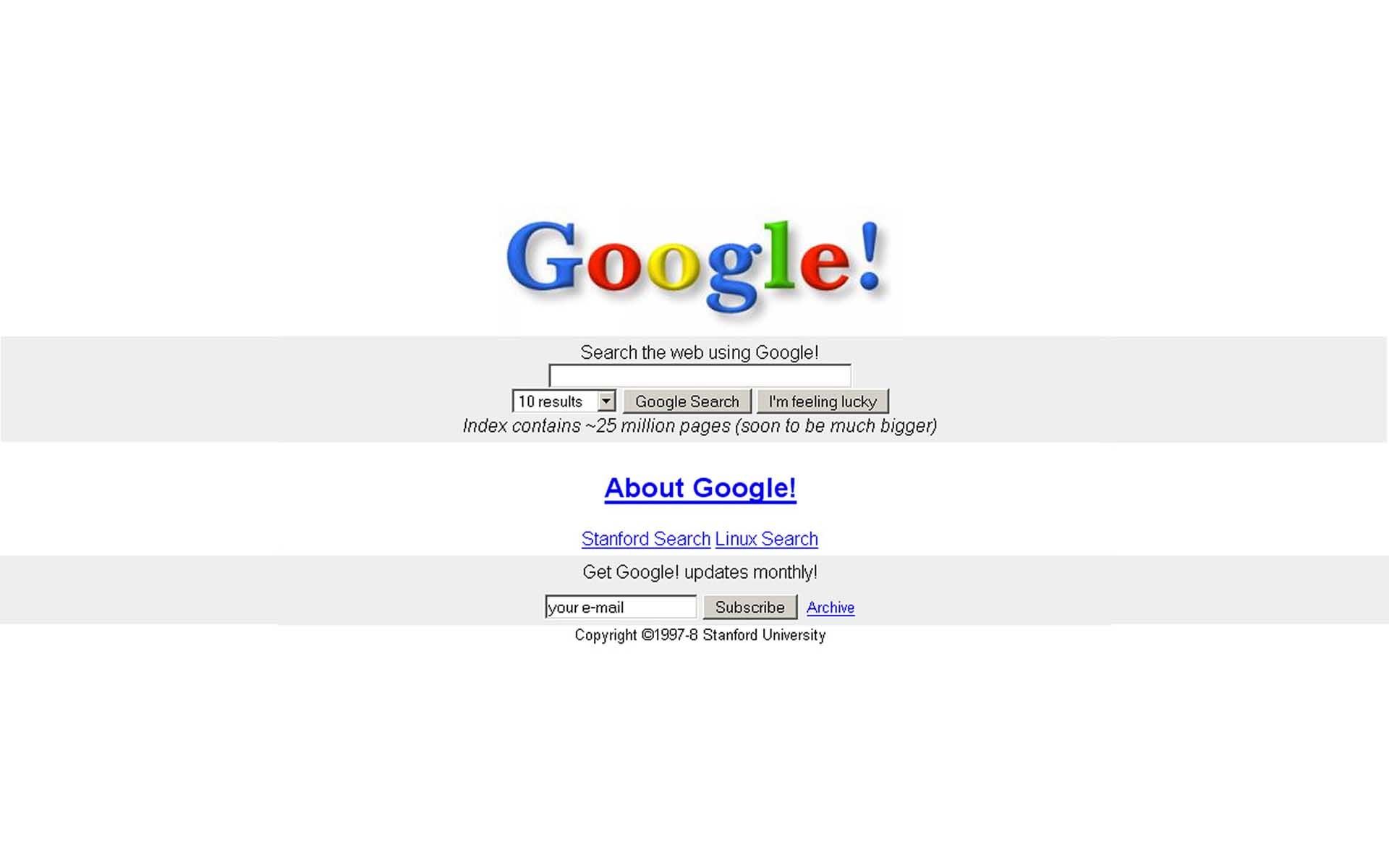
Google (1996)

Google (now)
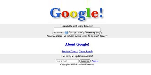
 Okay, technically I don’t think they had that exclamation in their business name even in 1996, but since it’s so prominent on the original homepage, it seemed appropriate to include it. As you can see from the image above, Google! allows you to choose how many results you want on each page, learn about the company, do other kinds of searches, and even “Get Google! updates monthly!” What’s probably most notable about the Google homepage of today is how little it has actually changed – at least in terms of design. If anything, it’s just gotten simpler. But if you look closely at the top and bottom of the screen, you’ll see all kinds of extra functionality that fades into the background nicely: buttons for Google+, Gmail, signing in to your account, advertising, business, and all kinds of other apps. Simple?Only deceptively so.
eBay - aka Auction Web (1997)

eBay - (now)

What lovely shades of gray and black they have. Back in 1997, eBay – er, Auction Web – apparently felt like they had a lot to explain, because much of the homepage is devoted to telling people what the site is about and how to use it. Which is understandable since the idea of an online auction house was completely unknown back in 1997. Wait, is eBay still an auction site today? Yes, although as you can see from the current homepage design, they’ve pretty much stopped marketing themselves and instead advertise brands, savings, contests, and so on. eBay is so huge that they know the concept doesn’t have to be sold or explained anymore; their goal is simply to highlight current promotions and direct you where you want to go. Oh, and it’s a lot prettier, obviously, with full-color images dominating the space in a way that both draws and pleases the eye.
Netflix (1997)

Netflix (now)

The original homepage for Netflix looked a lot like those fliers you get in the mail for your local cable service provider. In some ways, the fact that it had images and a clear message puts it ahead of sites like eBay, but they suffered from the same problem – the service they offered was so unique that they had to explain it, which means lots of salesy text. And the images themselves are more of the clip art variety, which is no one’s idea of good design. Now more of a streaming service than a mail-order delivery service, Neflix is able to simplify their message and create a cleaner, more attractive look. More importantly than that, though, they’ve realized that they are selling a lifestyle of sorts, and their gorgeous, full-screen images clearly depict this.
Weather.com (1996)

Weather.com (now)

Wow, that is not a good-looking page. Some of their ideas – navigation relegated to a bar on the side, seeing your own temperature and choosing local forecasts – are good ones, but overall the page just feels like a mishmash of colors and fonts and is very jarring. While the current Weather.com website may have a tad too much going on, there are definite improvements, most notably the addition of actual stories from around the country, images, and even videos that are prominently displayed. Additionally, smaller but definitely helpful design changes include automatically recognizing what area you’re logging in from and prominently displaying your specific weather.
Amazon (1995)

Amazon (now)

Back when Amazon was just books, it was also just ugly. The color scheme seems to be a combination of blue on blue on gray with a bit of orange, but mostly if feels like a whole lot of nothing. The text isn’t exactly overwhelming, but there’s still too much and everything is grouped together in a way that makes it hard to read. Technically, you can go to their spotlight books, search their database of a million titles, read reviews, and see bestsellers and a bunch of other categories, but from looking at this page you’d think there are only two options. The Amazon of today – thank goodness – is a lot more organized. Categories are on the left side, and they’re simple, clean, and streamlined. But before you even get that far, the first thing you’ll probably notice is that there are images everywhere. The big, central, scrolling image right now is advertising Amazon’s new pilots, but even their Geico ad and “list” of what other customers are looking at is done in pictures. Basically, they’ve found ways to communicate and sell in fewer words.
YouTube (2005)

YouTube (now)

Rivaling Google in design simplicity, YouTube didn’t have a whole lot going on when they first launched. In fact, with their request that you fill in the information for “I’m a M/F seeking X between AGE and AGE,” this looks more like a dating site than anything else, albeit one where you can view videos. There’s nothing on this page that lets you know you can actually upload videos, though, which seems kind of important. Look, today's YouTube realized that a site dedicated to videos should actually feature, you know, videos on the homepage. Beyond this, the modern YouTube also offers categories, suggestions for channels, and a list of what’s popular in case you’re the type that just wants to know what’s going to be talked about at the water cooler. To be fair to YouTube, though, they literally didn’t have any videos when they first started. The first one ever, in fact, was a 19-second clip of one of the founders at the zoo. You’ve come a long way, baby.
theFacebook (2004)

Facebook (now)

If you’ve seen The Social Network, then you have a pretty good idea of how much Facebook has evolved over the last decade as a company, but you might not quite realize how different it looks... or doesn’t, as the face may be. To be fair, that weird picture of Al Pacino is gone (good decision), the name has obviously changed, and anyone can now join and connect with anyone around the world as opposed to it merely being for Harvard students, but by and large the homepage (aka sign up screen) is pretty similar. What are the differences between Facebook in 2004 and Facebook now? Well, it’s cleaner, for one. Even though the original design attempted to break up the text into different paragraphs and bullet points, it still looks clumped together when compared to the sleeker, more modern design of today. You can also enter your information on the sign up page directly now as opposed to clicking a button to go to a separate Register page. But the biggest visual change is probably the fact that the body is now in two clean tables that really helps to make it look cleaner.
LinkedIn (2003)

LinkedIn (now)

Here’s what’s good about LinkedIn’s page back in 2003: they are able to sell you on the concept of the site and provide a good amount of information in a relatively short and simple way, letting you know what you can do and why you should do it. Still, the color scheme and layout look like something that just about anyone with a basic knowledge of graphic design could do. Let's look at today's LinkedIn. Unfortunately, we’re not comparing apples to apples here because the first image is obviously from a specific person’s account and thus has more information, but even here you can see that there’s been a design shift. This is a network of people, so they’ve decided to put up some images of people. And it’s not a white-washed site, either – you’re getting a whole lot of diversity in those six images, which befits LinkedIn’s status as a worldwide business networking site. Beyond that, much of the text is gone and the message is simple: “Join the world’s largest professional network.” Okay, I’m in.
Twitter (2006)

Twitter (now)

Not surprisingly, Twitter’s original homepage did a lot of explaining about just what you were supposed to do on the site. “What are you doing?” Seriously, we’re just supposed to post what we’re doing at that second. Wouldn’t that be incredibly boring? Not according to the millions that quickly made Twitter a success. But back in 2006 it was such a novel idea that the homepage not only provides their own visual example, but also includes a few Recent Public Updates just in case new users don’t quite get it. The page isn't attractive, but it does deserve points for showing people how to tweet rather than just telling. If Twitter’s current homepage is any indication, they’re no longer worried about people not understanding how to tweet. Their biggest concern is making sure that you know you can download a Twitter app for your phone and keep using their service on the go. The information here on the log in/sign up screen is minimal, but it’s a nice, attractive touch to have it floating in a sea of blue. Obviously, this is only a small sample of what’s out there. You can even find drastic changes to sites that have just been out for a few years. But it definitely opens your eyes to how far web design has come and how much a redesign can improve. What are some sites that you’ve noticed getting a big facelift?