

Icons are all around us: websites, smartphones and software - we even see them offline, such as in signage. Some icons like home, print, play, and search are so common that they don't require any explanation - we know exactly what they do whenever and wherever we see them.
UX Benefits of Icons
When icons are used correctly, they bring many UX and usability benefits. Here are five reasons why you should incorporate icons into your user experience:
- Icons are easily recognizable. If you use common icons in your designs, your audience will recognize them instantly, helping with navigation and tasks.
- Icons save space. This benefit is especially important on mobiles where using icons can save valuable real estate.
- Icons make good touch targets. The recommended icon size for mobile devices is 1 cm by 1 cm, an ideal target for tapping with your finger.
- Icons are universal. The meaning of icons can be easily understood, even if users don’t speak your language.
- Icons are aesthetically appealing. When well-designed, icons can make a website or app more visually attractive.

Common UX Mistakes
Unfortunately, there are many mistakes that UX designers make with icons that results in a poor user experience. The biggest one is assuming that users will understand what icons mean:
When Microsoft Outlook designed an icon-only toolbar, users did not know what icons represented. This resulted in poor UX and frustrated users. Once icons with text labels were introduced, people started using the toolbar as intended.
Other common mistakes that have been shown to cause usability issues include:
- Not having corresponding text labels.
- Using icons that don’t convey the meaning.
- Leaving too little space for icons on mobiles.
- Being ‘too creative’ with icons at the expense of recognition.
- Reinventing the wheel as opposed to using commonly recognized icons.
- Designing icons with too much graphic detail.
Icon Best Practices and Guidelines
Use the following checklist for icon best practices and guidelines to help you avoid the most common mistakes. Any time you see anyone not following these icon guidelines, help improve UX by tweeting it to them:
- Don't reinvent the wheel. Familiar icons work best (e.g. home, close, print, play, search).

- Use icons to save space and improve recognition in toolbars, functions, and navigation.
- Icons should be fast to recognize. Use icons that people have seen and used before.

- Don't change file type icons for file downloads. For example, use a “W” in a blue box for Word.
- Icons should always communicate meaning. Don’t overuse them or use them for decoration.
- Use the 5 second rule: If it takes more than 5 seconds to think of an icon, it will probably be ineffective.

- Icons must visually describe the function and purpose. Make them simple, familiar and meaningful.
- Always have at least 1 cm x 1 cm minimum around the icon for legibility and easy tapping on mobiles.

- When large enough, icons make good targets on mobiles where space is limited.
- Use a single icon set and ensure that all your icons are consistent and cohesive.
- Always use labels for icons and show them to the right or below the icon.

- A good test for an effective icon is when users can tell what it represents without a label.
- Don’t use icons with conflicting meaning. Icons that could represent multiple things should be avoided.
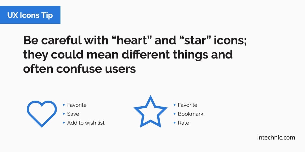
- Be careful with "heart" and "star" icons. They can mean different things and often confuse users.
- Keep icon designs simple and schematic. Minimize complex shapes and graphic detail.
- Make icons distinct shapes and colors. This helps users recognize and recall them.

- Avoid using similar icons for different purposes or different icons for the same purpose.
- When in doubt, remember the best icon is a text label.